Float
(Floaters:
4 )
Description:
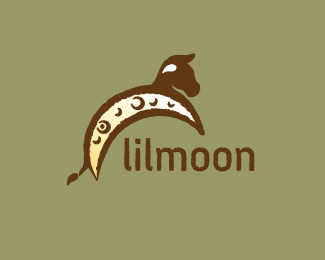
moon, craters, cow, nursery rhyme "cow jump over the moon"
Status:
Nothing set
Viewed:
2020
Share:

Lets Discuss
it will look more like a cow if u take its haircut off from up the head.. it looks like a horse now :x
Replyconsider making he moon a single color and the craters with a slight gradient
ReplyPremonsa, I appreciate the feedback. Although, the horse hair is his horn. So I'm not sure where to go with that. But thanks for stopping by.
Replyi tought it could be a horn, but i can not see a haircut instead of a horn... and u realize one horn is down and the other is up... its just confusing.. :x
Replyops, i can not see a horn instead of a haircut
Replysorry man, its a horse with a haircut :x
Reply%22the horse hair is his horn%22.. shouldnt it be a COW horn? o.O%0D*and u cant explain its a horn and not a haircut to everyone that sees the logo.. it must look like a horn, does not? o.O
Replywow, i should really practice writing down a comment before i post, so i dont get all these messages.%0D*%0D*Well, if u remove the haircut and turn the white horn up, maybe u get a better idea of where to go with the horn thing...%0D*%0D*:%7D
Replylooking better and better...love the crater texture on the side
ReplyPremonsa - No need to practice writing down your comments please let me introduce you to our little friend called the preview button. *:) It took me a few tries before I realized its full potential. *Ok on with the slaughter of my cow :) synopsis - Are you asking me to flip the white (COW) horn? because that's easy enough to do. Also I appreciate you thinking I am part of the guys club - huge compliment.
Replylogoboom - appreciate the encouragement. yes, the crater texture was what I initially wanted to achieve and JF had commented about that direction as well. Thank you for stopping by, you are always welcome :)
Replymaybe its just me..
Replyi dont know why one horn is up and the other down.. theyre out of 3d symmetry also (dark horn should be a little more to right side of screen?) :x maybe to look cartoonish?%0D*%0D*ok, its a cow with a haircut :x
ReplyPlease login/signup to make a comment, registration is easy