Float
(Floaters:
2 )
Description:
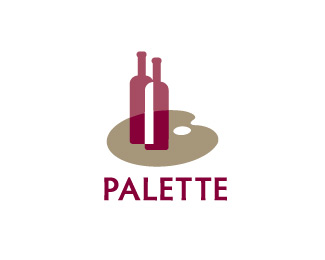
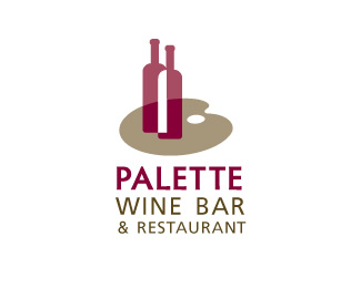
Wine bottles being served on an artist's palette/tray.
Status:
Unused proposal
Viewed:
2251
Share:


Lets Discuss
I'm liking the mark (not sure why the curves are so chunky though) but the typography is really bringing it down. Go simple.
Replydone. Thanks logoboom
ReplyLooking much better. How does it look if the neg space between the two bottles also knocks out the pallet?
Replyknocking to white doesn't do much but tinting the deep red ... maybe ... I post it as option2.
ReplyPlease login/signup to make a comment, registration is easy