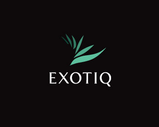
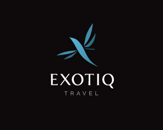
Exotiq
by misterjones • Uploaded: Nov. 29 '09 - Gallerized: Nov. '09

Float
(Floaters:
37 )
Description:
Logo proposals for Indonesian/Thai holiday and property agents Exotiq. This version uses the same 6 shapes to create a bird, a flower, a leaf etc. Created while working for Equus Brand Consultants Singapore.
Status:
Unused proposal
Viewed:
18819
Share:
Lets Discuss
Like this one the best out of the bunch.
Reply%5EI agree. The hummingbird 'Holidays' version works nicely too.
Replybest one
Replythanks for the comments. This one was supposed to be part of a series (group logo plus 3 sub brands) that all had another icon using the same 6 basic shapes. Client went for a monolithic brand architecture where all the logos are the same (humming bird), except for the color.
ReplyNice job Mr
ReplyThis looks great
ReplyPerfect!
ReplyThe different shades give a nice depth to it. Good job.
ReplyGreat set all around.
ReplyVery high end. Is it bad if I say I don't see a bird? Either way I would stay at this property!**
Replythanks everyone for the comments. Mochaleet, this one doesn't have a bird, have a look at my showcase to see the whole series.
ReplyI like!
ReplyI like them all - and think it okay to use them all - gives the impression of a non static, fluid, living company. Implies a lot about the region too. Let the logo move.
ReplyI mean of the fauna symbols...
Replywow.. perfect job jones
ReplyLovely job mr jones.
Replytt
Replywhat's that, mysight?
ReplyPlease login/signup to make a comment, registration is easy