Description:
Singapore based event and artists management, specialized in contemporary experimental culture.
Status:
Unused proposal
Viewed:
3246
Share:






Lets Discuss
I don't really... get it.
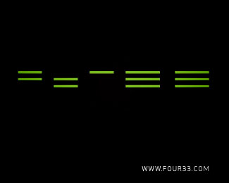
ReplyI like it. The first 3 groups represent a 4 and the last two groups are each a 3. Nice.
Replythanks, the name is 4'33, so i made an abstraction of the numbers with 4 elements for the 4 and 3 for the 3's. The accent is a divider between the 4 and the 3's
ReplyI couldn't see it at first, but after the explanation in the comments, I really like it.
ReplyOK so i saw it right away, and really like the idea....saw the dash (') and all. I do have one hesitation with this: each element is presented in its own column, except for the 4, which is divided into two columns.. almost like 22'33. Just a thought, the placement of the 2's is such that it looks enough like the 4, I think you get the idea. Did you play at all with the 4 as one column?
Replythis is an interesting mark, even i don't quite understand it, it looks very good.
ReplyPlease login/signup to make a comment, registration is easy