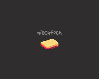
natura waxim
by milou • Uploaded: Nov. 19 '09

Float
(Floaters:
14 )
Description:
ecology, cleaning, nature stuff.
Status:
Client work
Viewed:
4767
Share:


Lets Discuss
I like your type. Have you thought of doing a more rounded letter(i.e. smoothing out the serifs.) As far as the middle mark, you might want to consider fanning out the lines to create a bit of a %22W%22 shape. I did a quick render to see what I'm saying:**http://i48.tinypic.com/14444g3.png**Good stuff!
Replyoh, thanks you trasher I will consider this shape, not a bad idea at all. but I don't know if client will like it. thanks anyway!
Replybardzo fajnie bratku
Replyciesze sie krzysiu
ReplyReally cool my friend.
Replythank you my dear.
ReplyI really like this. Simple and effective. I think it'd look cool with a second color on the type, maybe.
Replythanks Matt.
ReplyOn of the best!
ReplyOh, thank you kindly!
ReplyCool one, Milou!
ReplyHey thanks davishama.
ReplyPlease login/signup to make a comment, registration is easy