namazu
by milou • Uploaded: Oct. 26 '10 - Gallerized: Jun. '11

Float
(Floaters:
70 )
Description:
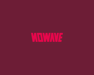
Interactive apps. Custom type.
Status:
Nothing set
Viewed:
12842
Share:


Lets Discuss
nice mark, nice type but a little tight for my taste... loosen it a tad.
Replylooks great!
ReplyThanks Paul, much appreciated but I think the kerning is good, I like it tight more than loose one, I tried that too.**Cheers Ivan!
Replygreat stuff mate, nice colors. i think i agree with mcdseven on the tightness but i don't mind it.
ReplyLove it.
ReplyStelian %26 Pierro, thanks a bunch mates!
Replynice work, milou:) the letter spacing bothers me a bit, though.
Replypretty cool there, Milou.
ReplyClaude %26 Mike, much appreciated masters!
Replythis is beuty milou:)
ReplyCheers Deividas!
ReplyTypo bardzo subtelne i slodkie, czuc Twoj styl Milosz %3B)
ReplyDzieki wielkie Kamil :-)
ReplyLooks great! Believe it or not I click on your profile everyday to see if you have uploaded new logos :P.
ReplyNice work man!!
ReplyNice work lad.
ReplyHey Filipe I'm really honored to hear that! I'll try to post something new more often.**Alan, thanks my man!!**Cheers Joey the Prince!
ReplyNice mark milou..
ReplyIt's a beauty Milosz:)
ReplyJippy %26 Roko, love you.
ReplyLovely mark milou
ReplyHey thanks Dennis aka !Mude!
ReplyHoly crap, man, congrats on the five front page spots! Wow!
ReplyHigh five!
Reply5 prac na raz w galerii, niezle men %3B)
ReplyThis is exquisite!
Replyoj niezle niezle! gratulacje :)
Replyhehe milou day here, very nice my friend!*
Reply%5EOh yeah, what a lovely day. Congrats buddy!
ReplyCongrats on the fantastic 5!
ReplyGreat detailing! I kind of see a C in the left side negative space - ya dig?
ReplySean, Nikita, Kamil, Nicholas, Mikolaj, Florin, Roko, Matt %26 Luma - Appreciate the warm words coming from all of you, I'm stoked to see five of my works on the fron page :-)
ReplyWoW. Five in a row. Milosz I bet that you are the next featured member.
ReplyHaha, it would be great, but honestly I don't think so %3B-) Thanks bud.
ReplyCongrats Milou!
ReplyThanks Fabian.**@ David, nice changes on the site. Can I ask you what is that On/Off button for?
ReplyThis is my own general rule on kerning, but I usually never tighten the kerning to the point the space between each letter is less than the width of the narrowest part of the letter forms. Otherwise you might as well run them together. Even letters need a little personal space. %3B)
ReplyDavid, I thought so %3B-)*Trish, it's good to know how you're doing stuff :-) I think I haven't done tight kerning (as this here) since creating it in '10.
Replynice work, beatiful fish!
ReplyWell done, very very nice!
ReplyAntonio Cappucci %26 sorgunalp - Thank you gentlemen!
ReplyPlease login/signup to make a comment, registration is easy