Description:
Home entertainment and security systems.
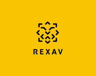
Client wanted a modern, minimalistic and abstract depiction of a lion`s head. Other keywords included: smart, honest, secure, strong, reliable, easy to work with and friendly.
To me, the only problem might be with the "friendly" part, as it turned out to be the hardest element to include along all other requirements of the briefing. "Smiley" lion just won`t look as a lion, or doesn`t feel right as a symbol for a company dealing with security solutions.
But, all in all, I`m happy with this design and hope that client will accept it.
You can find out more about this logo here:
http://midgar.eu/case_rexav_en.html
As seen on:
Rexav
Status:
Client work
Viewed:
16268
Share:


Lets Discuss
coool one
ReplyNice job!
ReplyBernd and Matt - thanks!
Replyyou did great - love this!
ReplyI like this too. Nice job.
ReplyHa ha. :)
ReplyVery good!
ReplyThanks all!**@Sean*Double thanks here:*1. Your Terex logo has been a real inspiration for me.*2. %22Ha ha. :)%22 - that%60s exactly the kind of response I needed! %3BD
Replywow, I've made something pretty similar a while back. I'll upload it soon so you'll see what I'm talking about :D
ReplyI think you met all of your objectives well, Lukasz, even the %22friendly%22 bit. See, when clients ask me for %22friendly,%22 I interpret this as %22approachable,%22 or %22easily accessible,%22 which this logo certainly is. I love the minimalist quality of this mark, and it instantly read as a lion head to me. So, mission accomplished! Bravo!
Reply@Andrei*waiting! %3B-P**@jon*Thanks jon, that%60s exactly the approach I wanted to sell to the client. And I don%60t mean it in a marketing-mambo-jambo sense. %22Friendly thru smart and approachable%22 seems like a good concept, considering the target audience and that it also has to stand for home security solutions. And who wants a smiling lion anyway? %3B-)*One way or the other, the closure is a happy-end, cause the client accepted the project yesterday:-)
ReplyHey, Lukasz. No, no, the Ha Ha was a chuckle I had for the client as I assume he's watching this thread. He was all set to go forward on this project with me and then apparently my quote was too much for him. That's all it was, the work is nice, I like this and I think it is along the lines of what he wanted to see. He wanted something quite close to my Terex logo (interesting the name?) but needed to have some distance from that. It might be interesting if it had a bit of a smile somehow. Nice job on this, buddy! The other lion you did was very cool too!
Replynice logo, bud. And it's always a little shady talking to clients who've contacted you via logopond. What's stopping them talking to other designers on here? I don't have a problem with that as long as it is only to find out prices. Again, nice work here.
ReplyI think it works as is, good solution.
Reply@Sean*Ha! Now I feel not only stupid, but also cheap %3B-D**@Nathan*I don%60t have a problem with clients contacting me via logopond - as long as I get me pre-payment I consider them committed enough to start the job.**@Rudy*Thanks!
ReplySimple and minimalistic.
ReplyWorks great!
Reply... and I do like animals on yellow! :D
ReplyGreat iconic logo!
Replyclever, very very nice
ReplyAwesome really awesome
Replyvery unique ..love your style...V
ReplyExcellent looking logo. Great colors, simplistic and very accessible. Very well designed!
Replyit is great work ! i so love it . good, you are great designer !
ReplyPlease login/signup to make a comment, registration is easy