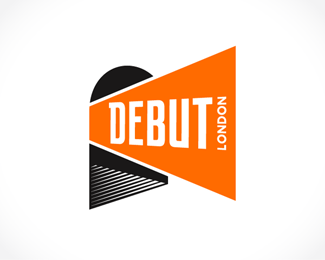
Description:
Designed for a multi-purpose entertainment venue in central London, located beneath the arches of London Bridge Station.
The 3K capacity venue will host everything from large concerts, to boutique film screenings, and corporate events.
*Intital identity set can be found via FLICKR
As seen on:
www.DebutLondon.co.uk
Status:
Client work
Viewed:
9090
Share:


Lets Discuss
I like it, Mike. looks like it would be a fun place to hang out.
Reply@Mikeymike - Cheers Mike! Thanks again for the help in the monogram dept. %3B)
Replynice to see how this turn out. by the way, don't you think it might be a bit more natural to read if the %22london%22 faces to the right? just wondering...**cause right now, when i'm reading %22DEBUT%22 from left to right, the flow is like shouting out from the arches, but to read %22London%22, the flow goes opposite. curious if that contrast reading direction is what you intended.
Reply@kathariney - Thanks a lot Katherine!**As far as the orientation of 'London' %3E I get what you're saying with the flow, but I think what it comes down to has more to do with a natural read (like you said)...**However, if you think about how you'd have to read it were it facing left...you'd be reading 'Debut' from (Left to %3E Right), then when you hit 'London' you actually have to (tilt %3C left) against the flow to read it properly.**Vertical text is always tricky, and in most cases I actually try to avoid it... However when I have to, in terms of achieving maximum readability, I think it simply comes down to the fact that the most natural read for most people is generally going to be ('Right to Left' %26 'Top to Bottom').**In terms of the conceptual execution of the direction, I think it's really not much of a stretch either way. Again, I think it simply comes down to how much you have to tilt your head... %3B)
Replyhahah yea, interesting discussion. also when I'm holding a photo with both hand, it's more natural for me to tilt the photo by rotating it clockwise with my right hand (pulling the pic towards me with my right hand). that's why this issue jumps out to me right away %3B)**Oh, since this word isn't too long, another possible way is without tilting your head, just let it reads:*L*O*N*D*O*N**But then in terms of the flow of reading, it might become a %22wall%22 to stop the flow right there.
Reply@kathariney - Ha! Indeed... Good points all around.**'It's all about the flowwwww man...' %3B)**Ha! Now, I feel like I should go rake some sand %26 drink some tea...
ReplyThis is very memorable.
ReplyI'm really digging this. Looking forward to the upcoming pieces.
Replythat is super hyper cool, my friend.
Replyaaaaa..jus to get a better idea form the pondies, put the other ver wid london flipped...:P
ReplyLooks good to me. Liking it a lot Spitzy.
Reply@OcularInk - Thanks a bunch!**@Thrasher317 - Cheers! (Might be a bit of a pause on the whole set, given that I'm away for a bit later this month)%3Cbr%3EBut I'll be sure to post a link as soon as I'm done! %3B)**@milou - Thanks a lot buddy! :)**@absoludicrous - I'm with you Tony %3E But simply to clarify... %3E%3E%3Cbr%3E@nitish.b - I'll post a 'flipped' version, just so everyone can contrast %26 compare... %3B)
Reply@Chad Sanderson - Ha! Thanks a lot Chad! %3B)
Reply@kathariney - Well, there seems to be a bit of a consensus for the flip...%3Cbr%3EFresh eyes after a looooong night, and I think I too am leaning your way %3B)**Cheers!
Reply*UPDATED*
Reply@anthony, well not that you have to literally tilt your head in order to read it. but what i pointed out is how the direction of the text direct your eyes to read. DEBUT( ---%3E) London facing left (%3C---). **@michael: wohoo. now the flow of reading the mark is ---%3E---%3E*personally i think it reads better cause it seems to fit with the orange shape better. Orange shape is like shouting out from the tunnel, and the flow of the words is doing the same now. **I have to say both ways works fine. but it's a better of which impression you want. *the ---%3E %3C--- way , some (includes me) might find it unatural, but some might find it interesting. *the ---%3E---%3E as i've said, that's the way my eyes wants to read**btw, what to you think about making the contrast of the sizing of each letter slightly more obvious?and i like how you bolded %22UPDATED%22 hehe.
Replynot know why part of my message was gone.... :*but what i pointed out is how the direction of the text direct your eyes to read. DEBUT%5B ---%3E%5D London facing left %5B%3C---%5D.
Reply@kathariney - I think we've got it now... %3B) Thanks again for the thought on the direction.%3Cbr%3EA fresh set of eyes is always a good idea. Cheers! :)
ReplyThis is brilliant, mate, very memorable and recognizable. Perfect!
ReplyNice!! made gallery. I know you put a lot of work into this one. nice final.
Reply%5E%5E what most of they all said, nice work man
ReplyGratz on the FP, MS! WD! %3B)
Reply%5E%5E%5E%5ECheers guys!! Thanks a ton guys!! :)**Really happy this made the gallery!%3Cbr%3EDefinitely put some time %26 thought into this one, and it's excellent to see the positive response.**As always %3E I can't thank everyone enough for keeping up with me along way!%3Cbr%3EThanks again guys!
ReplyLove how this turned out, Michael. You spent some quality time finessing this one and it's excellent! Keep rolling, bud.
Reply@chirp - Cheers Todd! Thanks a lot! %3B)
ReplyI like where it ended up, Michael, nice job! Congrats on the gallery spot too.
Reply@ethereal - Thanks a lot Sean!
ReplyHey Michel,*Nice ending man....
Reply@sbj - Thanks very much!
Replythis guy would look really sweet on a letter head...:)
Reply@nitish.b - Ha! Actually working away on it as I type... %3B)**I'm going to be out of town for most of March %3E so the project's probably going to trail into April...%3Cbr%3EBut I can't wait to get the whole package together!**Thanks again my man! Cheers! :)
Reply**UPDATE****So I've got a preliminary (WIP) ID set for this guy floating around on %3Ca href%3D%22http://www.flickr.com/photos/michael-spitz/4506711972/%22%3EFLICKR%3C/a%3E if anyone wants to have a quick look %3B)**The letterhead %26 card have gone to print %3E Card's getting a raised white print job on the reverse...can't wait to see how it turns out! Additional dark %26 orange stationary material still in the queue (this is the corporate set for the moment). Web launch still to come...**Thanks again for all the feedback guys! Cheers!! :)
ReplyJust checked it out, gonna look great off the press :)
ReplySweet, looks great! Love the stuff!
Reply@Hayes Image %26 ethereal - Cheers guys! Thanks a lot for the look! :)
Reply**UPDATE****Posted the site link %3E Not live yet, but as I understand she's gettin' there... %3B)*%3Ca href%3D%22http://www.debutlondon.co.uk%22%3Ewww.DebutLondon.co.uk%3C/a%3E
ReplyReally do love this, completely memorable, I keep coming back to it
Reply@eziemac - Always an excellent thing to hear when it comes to ID work! Thanks again Euan!! :)
Replyvery nice mark!
Reply@myway999 - Thanks a lot!
ReplyGreat job Michael, love the entire package.
Reply@mcguire design - Thanks a bunch! :)
ReplyJust saw everything with this...looks wondering Michael. Nice work!
Reply@JoePrince - Thanks a ton Joe!**The physical signage is actually being produced right now...%3Cbr%3ECan't wait to see it all finished %26 backlit!**Cheers buddy!
ReplyAwesome, your works are really inspiring...
ReplyI love the visual of this one!
ReplyPlease login/signup to make a comment, registration is easy