Pattern Analysis
by michaelspitz • Uploaded: Mar. 10 '11 - Gallerized: Mar. '11

Float
(Floaters:
60 )
Description:
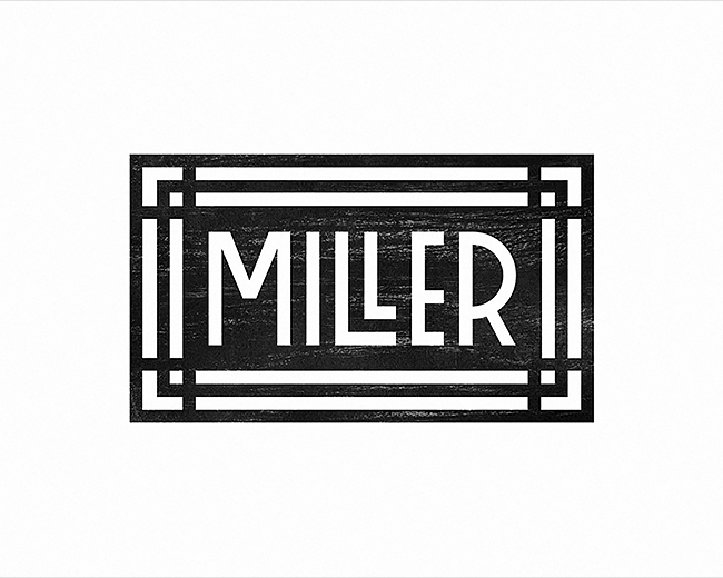
Logotype designed for a company that performs forensic pattern recognition & analysis.
Identity material to be de-bossed with raised typography.
Status:
Client work
Viewed:
11466
Share:


Lets Discuss
Cool concept here, Michael, but will it come through when this get translated into the b%26w? Maybe you could do something with those A%60s to make em slightly dif from the rest? Just a thought..
ReplyNice idea fits the purpose well.
ReplyNice Mr Spitz.
Replygreat find Michael :)
Replyditto
Replynicely done my friend
Replylove the subtlety in your approach here.
ReplyClever! I would love to see it printed that way.
Replyvery very smart! love it :)
ReplyWell done man :)
ReplyMichael, has done it again. Nice Mike.
ReplyNice Mike.
ReplyJust saw this guy got featured... Thanks a ton for all the comments guys! Greatly appreciated! :)
ReplyPlease login/signup to make a comment, registration is easy