Description:
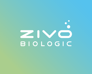
Bespoke logotype for a nutrition focused biochemical engineering company.
*Update on the V1 > HERE
As seen on:
Status:
Client work
Viewed:
6420
Share:




Lets Discuss
@Type08 - Not a bad idea re the 'V' for balance... My play on the 'O' was an oxygen cue (their primary products deal lot with water, etc.).
Reply@Type08 - Yeah, I hear you on the book thing %3E so that's maybe not a perfect option, but it definitely made sense on the balance point...
Reply@AnthonyLane - Thanks Tony. Yeah, I think everyone's set with it at the moment (it really does mesh rather well with what they're aiming for). Again 'Biologic' might shift a little bit...but I'm pretty happy with the overall execution as is.
ReplyPure goodyness here MS, don't change a thing man!
Reply@JoePrince - Thanks a lot JP! :)
Replylooks awesome, Michael. Just a question. does the %22I%22 look a tad thin? or maybe its just me. love it though. nice work.
Reply@Mikeymike - Thanks a bunch buddy! :) For the 'I' %3E Probably looks a little narrower because it's the only one that's a true upright... I look into a slight optical balancing %26 see if it makes any difference. In any case, it's definitely the same width, I checked %3B)
ReplyThat's a solid type mr Spitz, and the dots are fine for me, I've connected it to the name quickly.
Reply@milou - Cheers buddy! :)
Reply**UPDATE** - Final logotype %3E Identity development in the works...
ReplyPlease login/signup to make a comment, registration is easy