Float
(Floaters:
14 )
Description:
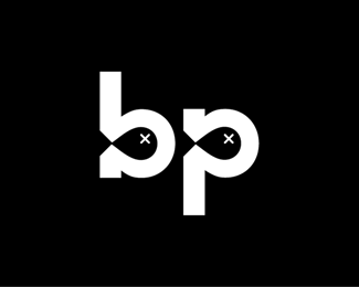
A little jab at our friends over at British Petroleum...
Status:
Just for fun
Viewed:
5408
Share:


Lets Discuss
Does anyone have any thoughts on how I might bump this guy up a couple notches..? I'm getting mostly yay on concept, but a few mixed reviews on execution.**Apparently it's not very popular on the pond %3E but of course that's understandable. I mean, who wants to see oil in the pond %3B)
Reply%5EI've received a suggestion to move the tails outside the letterforms %3E thus adjusting the the widths %3E which I actually kind of like, but also agree are kind of strange. I'll post a refresh after I play around with it a bit more...
ReplySorry for blanketing the comment board... %3B)**%5EJust uploaded a reworked version.**
ReplyGood thinking, Michael! Very funny, and sad... ):
ReplyBig improvement with the fish tails extending outside the letters.
Reply@vld - Thanks a lot Vlad! Indeed, indeed... :(**@OcularInk - Thanks Kevin! I definitely agree %3E it feels a good deal more resoved than it started out.
ReplyI like it better with the black background. You guys might thing of this as a catastrophe, but I see it as bp giving us lots of free oil. Lots and lots of free oil...
Reply@MSdesign - Thanks, glad you like that one %3E it is the original.%3Cbr%3EAs far as the free oil, I'm sure the fish, along with those living on the Gulf probbaly beg to differ...*If in the end BP has to give us something, I'd definitely prefer they give us a bunch of %3E %3Ca href%3D%22http://logopond.com/gallery/detail/103956%22%3E(THESE)%3C/a%3E
Replyf.nice!
ReplyPlease login/signup to make a comment, registration is easy