Word of Faith
by mfrank • Uploaded: Jul. 28 '10

Float
(Floaters:
21 )
Description:
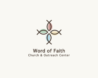
Word of Faith church creates a people-orientated atmosphere and hold outreach programs for the local public.
Update from http://logopond.com/gallery/detail/111303
Status:
Client work
Viewed:
6267
Share:


Lets Discuss
powerful line work (both concepts)**the lettering... crowded? I think you can pair it better as this mark is super**Have you tried centering the layout - would make it more grand and less product/service like
ReplyAh, I'm liking this one too. Nice update. I'd like to see Raja's suggestions implemented. The center layout could work out well. You might even try giving the type some serious tracking to offer a nice sense of elegance. Just an idea, though, may not work.
ReplyThanks for the feedback raja and kevin. Like usual I'm struggling with pairing the type. I'm not satisfied with it either. I will try out both ideas.
Replyi am not getting what the mark symbolizes..:( i would love to know, franky
ReplyIt resembles a figure with his/her arms outstretched as if worshiping. I can also make out the fish symbol.
ReplyBeautiful work, looking forward to seeing the vertical layout.
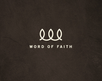
ReplyUpdated to a centered layout.
ReplyI liked it before, but I like it better this way (vertical). very nice.
ReplyNice update Matthew. Like very much this one.
ReplyGreat job, it now feels more outreaching.
Replyhey mfrank - glad to see you are open to make changes.**why are you keeping the descriptor line so small, in italics, so crowded, and so close to the name?**you can go really BIG with this idea if you pay attention to the most basic of design principles
ReplyHey Raja thanks for all the feedback...it's appreciated. I've updated per your comments and it looks a ton better. I'll keep messing with the spacing between the mark/name/descriptor some more and overall size.
ReplyGreat line work. Nice colors too.
ReplyBeautiful symbol, love the eloquence.
ReplyPlease login/signup to make a comment, registration is easy