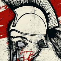
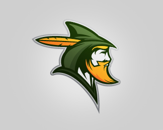
Artemis
by malicho • Uploaded: Aug. 26 '10 - Gallerized: Aug. '10

Float
(Floaters:
54 )
Description:
This is a proposal for an office furniture design center. The name has deeper meaning to the company so we (Cobb & Associates) put together a logo proposal. Since we're still working out some specifics critiques are very welcome.
Status:
Unused proposal
Viewed:
14232
Share:
Lets Discuss
thank you very much
ReplyI think the typo is too thick, I think a more stylized font match better with a design office furniture company. Just a constructive comment... The illustration is really nice by the way.
ReplyVery cool. I would love to hear more about the symbolism here, and the connection to the company. Great illustration
ReplySure lumavine, when going through the brandcamp with the client we asked them all kinds of questions about their history (personal histories in the community and the company's history within the community). Just to sum it up a bit they were all avid bow hunters and were involved in a lot of charitable things in the community, so we brought up Artemis (Greek goddess of the hunt and goddess of children). This was only one of a few logo drafts we made for them after going through brandcamp with them, it wasn't chosen in the end though.
ReplyI agree Gonzales, the thick type isn't personally my favorite, but a serif font was presented, the client liked a bolder more masculine look.
Replywell of course, because Artemis is SUCH a chick. %3B) floated.
ReplyI also like the illustration, but wasn't Artemis associated with the moon, and Apollo the sun? Sorry to get so nerdy, I love the mark. I just wonder how it may look more %22ethereal%22 if the sun was a moon...
ReplyI think that this is an amazing logo. Any company, using it should be proud.
ReplyYou're right truenorthe, this was the colors the client wanted so we kept them for this upload, although the colors work just as well IMO as a purple or blue for the moon (we originally designed it to be the moon in the back, not the sun).
Replythanks amasrik!
ReplyGreat illustration, I think a hint of the bowstring might add to the mark. And the type is too thick for me, it doesn't reflect the nice thick and thins in the mark. But great design!
ReplyHi malicho!%0D*Love your work,%0D*Is there an Email I can contact you directly?%0D*%0D*%0D*Thanks, good day%0D*Jen.
ReplyHey Jen, you can contact me at: bbolligdesign@gmail.com
ReplyHi Malicho,*Sent you an Email with a question,*Waiting for your respond,**Thanks again*Jen :)*
Replyamazing work!!!
Replygreat illustration ..great work
ReplyWould perhaps be cool to see the bow limbs come back a little to parallel the sun's contour. A string on the bow... not required I guess, but may help. The shadow under her chin looks a bit like a beard. I disagree with Gonzales. The font has to be heavy here.
ReplyPlease login/signup to make a comment, registration is easy