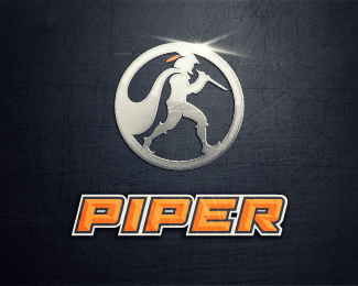
Description:
Previous version (http://logopond.com/gallery/detail/160748) was a bust, so a new approach here. Added their preferred typeface in for reference.
Status:
Work in progress
Viewed:
4407
Share:


Lets Discuss
Love the mark here can definitely see it as simply a stand alone mark. I would say no to the lens flare across the top. Works well enough to be strong without it. I also liked the previous one this was based off though but definitely as you mentioned it just simply looked like robin hood while this one takes its own personality. Well done.
ReplyThanks for the comment JRG. The lens flare is just an effect I gave them (they work in the oil/natural gas business) and wanted to give it a look of metal for their viewing purposes. The who process without the metal effect and just the vector is here: http://www.flickr.com/photos/brianbollig/6968764123/sizes/o/in/photostream/**thanks for the thoughts!
ReplyPlease login/signup to make a comment, registration is easy