Description:
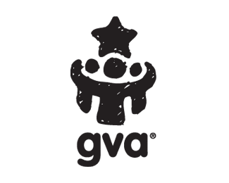
Private elementry school employing reward based learning systems and an emphasis on community/mentor-student relationships.
The client wanted something both playful and iconic while still communicating the focal elements of community, mentorship and reward based learning... The result was the triple figures (one larger \'mentor\' figure with arms around two others) gathered around a common focus of education/reward. (star)
Predominant use in various print media and signage.
Status:
Nothing set
Viewed:
12504
Share:

Lets Discuss
Yeah i just found this too! very nice
Replyloove it
Replyagreed really nice mark.. but the carpet should match the drapes :P
ReplyWhat is it?!
Reply%22triple figures (one larger 'mentor' figure with arms around two others) gathered around a common focus of education/reward%22
Replyaha! however I think is not interesting, what reason was added to the gallery?
ReplyWith a hand drawn style/texture to the text it would be perfect! I like it!
ReplyI saw a big crazy clown face. Mouth open with two lower teeth.
ReplyI think some color would help the mark emphasize playful and for some reason the mark feels tilted or falling over to the right, maybe it's just me.
ReplyGlen, who do you mean?
ReplyI thought i was crazy! Thanks Glen! I also saw a clown face!
Reply%5E Good for you, I'm seeing Stonehenge.**If the type would be in the style of a mark it could be awesome though (:
Replyhave seen better works in the gallery than this...%3B-)
Replynice idea
ReplyIn the gallery and 24 floats with 2915 view! it's a joke! %0D*should be more careful in choosing logos.
ReplyPlease login/signup to make a comment, registration is easy