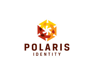
Description:
Polaris identity offers a complete, turnkey solution for the design, planning,
engineering, procurement, manufacturing and installation of wayfinding
and identity systems. Proposed concept #2
This identity will be published in the "Shapes & Symbols" edition of the LogoLounge Master Library series.
As seen on:
Status:
Client work
Viewed:
9941
Share:

Lets Discuss
Those arrows create a very nice effect Bojan. Well done.
ReplyVery dynamic! I like it!
Replynice effect indeed:)
ReplyI love this one.
ReplyThanks. This is my favorite concept too.
ReplyO boy, i%60ve been looking at this logo the other day. One of the logos that client mentioned as a well executed was this one %3B), but i%60ve just now saw the arrows. Ha. But that one wasn%60t used transparency and colors were dif - blue%26green. It was looking clumsy and kinda busy. This is much much better now. Good job.
ReplyI simply assume that it is intentional, but why is there no overlapping effect for two of the arrows?
ReplyArrows are playing catch-up! :-)%0D*Looks good!
ReplyI really like this mark! It's clear and simple.
ReplyThis is fantastic - loving the asterisk in negative space!
Replyawesome work. very creative way of using the arrows, man, nice.
Replycongrats on the feature Bojan, looks good
ReplyLooks good!
ReplyFolks, thank you for very kind words! Client is also pleased on how this baby turned out at the end. Cheers!
Replyfound copy on http://99designs.com/logo-design/contests/heating-cooling-company-logo-38012/entries/165
Reply%5E sigh...
Replynice job Bojan, shame about the rip
ReplyGood catch contrast.*I've already reported the guy.
ReplyVery nice.
ReplyThanks again!!
ReplyIt's going to be published in %22Shapes %26 Symbols%22 - LogoLounge Master Library :) Gotta inform them clients, reckon they will be happy too!
ReplyPlease login/signup to make a comment, registration is easy