ALCO
by logoholik • Uploaded: Dec. 12 '16 - Gallerized: Dec. '16

Float
(Floaters:
27 )
Description:
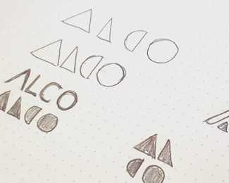
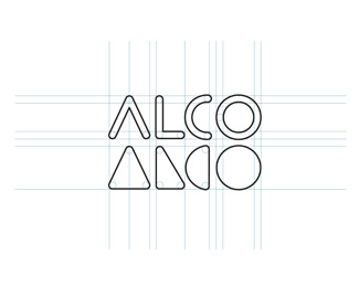
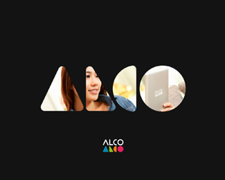
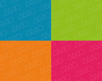
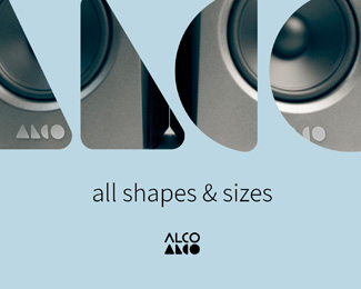
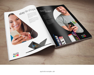
Alco Re-Branding Case Study on Behance:
https://www.behance.net/gallery/46246651/ALCO-re-branding-case-study
As seen on:
Alco Re-Branding Case Study
Status:
Client work
Viewed:
7912
Tags:
rebranding
•
Geometric shapes
Share:


Lets Discuss
Nice!!
ReplyI'm torn on the repetition. I love the case study and I see the symbol only version. Maybe that would read over time. But the type and symbol together... I dunno. It's an unusual lock up. And maybe that's a good thing.
ReplyDavid, you got it right :) Thanks!
ReplyI like this one!
ReplyThanks @BennethCreatives
ReplyThis piece got in 2017 logo trend report! Yay :) https://www.logolounge.com/articles/2017-logo-trends
ReplyPlease login/signup to make a comment, registration is easy