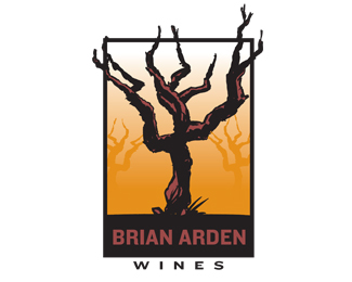
Description:
Logo for a premium Napa Valley wine maker.
Illustration and logo design for Damion Hickman Design
Status:
Nothing set
Viewed:
4173
Share:



Lets Discuss
Hey Bro - could this be read as a bad year for wines because there are no grapes?
ReplyEvery year in the winter, the grape vines—some as much as 50 years old, go into dormancy and are trimmed back to look like this. Many wine enthusiasts and vintners find this rather sickly looking vine very romantic and evidence of a well aged and seasoned vine. At first, I thought much the same thing, but now I think it's pretty cool. This rendition is certainly better than the photos I got from the client%3B)
ReplyHow come this has no flotas. I think it's great piece.
ReplyThank you. **This was actually one of the concept directions that was not chosen. Here is where the logo finally ended up: http://bit.ly/9inKVL
ReplyIs that one also yours? It's a great work.
ReplySorry, i rushed into questions before reading the actual article.
ReplyNo worries. **Initially, I was hired to do the logo illustration and contribute design concepts. I rendered several grape vines, created a few concepts like this one and after a couple of rounds the design firm completed the assignment. They did eventually end up with my logo illustration in the final design. **The illustration was created with a brush and India ink, then converted to vector form.
ReplyTotally loving the illustration 'on bottle'! Great stuff!
ReplyPlease login/signup to make a comment, registration is easy