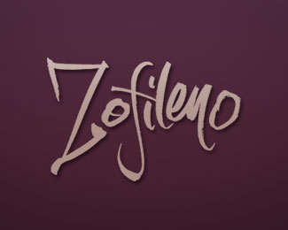
Description:
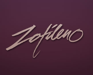
Brushed, hand-lettered logo design for a vintner with several varietals being offered. Several lettering designs were created for this project.
Status:
Unused proposal
Viewed:
2704
Share:

Lets Discuss
Like it...but the Z %26 f don't have the same natural flow as the rest of the letters.
ReplyThanks for the comments, Fabian. I don't know, I thought those letters are what gave the logotype it's whimsy and character. I could be wrong.
ReplyYeah I'm liking the other. This feels too playful.
ReplyPlease login/signup to make a comment, registration is easy