Description:
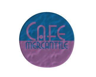
this logo was created for a coffee house, called cafe mercantile. i took the defination of mercantile which is to be trade done by merchants, so i applied it by taking a simple circle and inversing the colors of the text to match the color of the half cirlcle that is opposing them. so it as if the text had "traded" the color with the other sides backround. then i added a little fx, just to make it look more worn, and pop a little bit off the page.
Status:
Student work
Viewed:
866
Share:




Lets Discuss
Well done Lance. I really like the font and the center alignment. You may want to work on the contrast of the logo since it blends in. Over all I think you did a good job.
Replyi like it a lot but I'm not big on the texture look and the colors, two dark colors or that they are so close color wise together I'm not sure about. Maybe a orange or a lime green i think would look good then the purple. I like the Circle and the font and how you have the colors interchange like that.
Replybrooke, why do you not the texture look? i can understand the color contrast issue, but please elaberate on why you don't like the texture.
Replymaybe its the texture mixed with the colors, i think if the colors were different the texture would look a lot better. but it seems like its a different part or section, not like all together as one is what i mean.
Replyi can picture the purple as a lime green, if so then i think it all would pull together very well and it be a very successful logo!
Replythat texture only takes away from the logo. to my eye it cheapens it. the texture looks pixelated and old fashioned (but not in a good way). and the texture makes your circle look bumpy and badly done. please, dump the texture.
ReplyI like the idea, but with everyone else, I don't like the texture or the colors for that matter. It looks to 90's to me. But I love the font and how you placed it.
ReplyI like the idea of the logo, but I also like the background image because it shows some depth in it. I think there should have been a stroke around the lettering to show off the name, but other than that it looks great by how you made it with two simple colors.
Replyno strokes! strokes bad! your text is perfect. the color needs help. I doubt anyone with eye issues - color blindness, astigmatism, even eye strain, etc. - would be able to read clearly this logo with the current color scheme. the so called texture does not help the color. maybe if you changed up the color a bit, the texture may not seem so bad. doubt it. but anything is possible.
Replylancegarcia,
ReplyYes, Yes and Yes. I agree with a lot that others are saying about this logo. THEArtisT hit it right on the head about the font (text). We all know by now that color is an issue. As BabbeyLynn commented the texture takes away (makes hard to read). The texture is raster and one of the MAJOR rules of logo design is don't use raster items (it would be very hard to say cut this in vinyl), your effects just wont transfer. Your raster effects also make your circle not look perfect (a perfect circle). This takes away from the over all look and feel of the logo. If it were me I would make three changes: 1. Change the color. 2. Take off the texture. 3. Make sure the circle is perfect, then you will have a close to perfect logo!
Please login/signup to make a comment, registration is easy