Description:
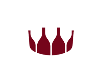
Revised mark (added top perspective, different bottle height, left and right edges not vertical any more).
More crown-like?
As seen on:
logo design portfolio
Status:
Work in progress
Viewed:
3522
Share:


Lets Discuss
When I first saw it, my first reaction was %22teeth%22.
ReplyFor me it's crown made of bottles.
ReplyI see wine bottles and (inversely) wine glasses. Nice idea. I would suggest ammending bottle finish/lip with a subtle more natural curved edge.**However, nice idea!
ReplyI'm afraid this idea has been done many times before on Logopond.
ReplyPlease login/signup to make a comment, registration is easy