enigma
by janzabransky • Uploaded: Jun. 23 '10 - Gallerized: Jun. '10

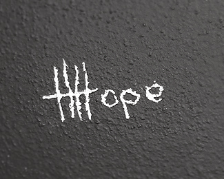
Float
(Floaters:
82 )
Description:
I always liked ambigrams so I have tried to make one, too. This is just for fun. Mads Burcharths AWESOME ambigram inspired me.
As seen on:
My blog
Status:
Just for fun
Viewed:
12131
Share:


Lets Discuss
Well done, great try!!!
ReplyThanks Terry, I thought this word with its meaning should be good executed as ambigram.
ReplyIts not only the meaning that works well, love the way you created the G and the type in general, all customised text I'd guess? One critique change the background to just one dark colour and this should go straight to Gallery.
ReplyAt the smaller size it's more readable than when it's bigger. That, in itself, is an enigma. Nice work!
ReplyYes youre right ... its not schwabach which is used often on ambigrants, but geometrically based custom made typo. Thanks for advise with bg, I will consider it. I am maybe crazy but at this time I like that white little creature on upper left corner as part of a background texture. It was not my intention to draw it, really. It looks so enigmatic and mysterious to me. What the hell it is? Squirrel? Does anybody else see it too? :-)
Replymagical :)
ReplyGreat work Jan! Loving the geometric feel!
Replyawesome.
ReplyThis works perfectly Jan, congrats.
Replyrealy nice work Jan!
ReplyGreat Jan.
ReplyNice Jan, the name certainly does sum up the ambigram. :)
ReplyThank you guys a lot for giving me feedback.
Replythis is sooo cool...
ReplyI prefer that bg, the ambigram really jumps of it now.
ReplyThanks for suggestion Terry, You was right :)
Replyit's interesting how well the G reads, though it doesn't really look like a G. great work.
ReplyI like the readability. Great!
ReplyBravo!
Reply@Oguzhan @Stelian @Rostislav @Nikita thanks guys for nice feedback.
ReplyWorks well Jan. Bravo!
ReplyVery well done, mate.
ReplyYep, straight to Gallery! Well done Jan!
ReplyThat is great, thanks.
Replynice one
ReplyAwesome :)
ReplyOhhh, I like ambigrams. This is inspirational. Good job.
ReplyG R E A T !
ReplyGreat stuff, Jan!
ReplyI think this a bit poor logo. You can just find a %22ambigram generator%22 (google it) and you write enigma, and so have you a logo!
ReplyI don't think it's a poor logo, ambigrams take a lot of blood sweat and tears. I know janzabransky can create awesome conceptual logos and I am sure this is original work.**At the same time I agree with... let me cut and paste the screename... andreasvnielsen that any word/s can be made into ambigrams easily with online generators. For instance, if you use the word 'enigma' on the site below...**%22click flipscript.com%22:http://www.flipscript.com/ , you will see what I mean.**Sorry to break it to logopond...but hey, with a couple of tweaks, whose gonna know right?**
Reply%5Ewow... I just checked that out... thats brilliant!.. if its that simple from now on I just wont be so impressed by ambigrams anymore...
Reply%5Erofl
Replywell done
ReplyGood work Jan.
ReplyThank you guys for comments. @Andreas, please dont take it so seriously, this was made just for fun :-)
Replyi read a bit %22enisma%22 i think if you cut the void space inside the %22g%22 it would be more functional %3D)
Replygreat ambigram...
Replyone of the greats! the g blows me away!
ReplyPlease login/signup to make a comment, registration is easy