Description:
Uploading this as the answer to http://logopond.com/gallery/detail/132656#hyperborea_268871
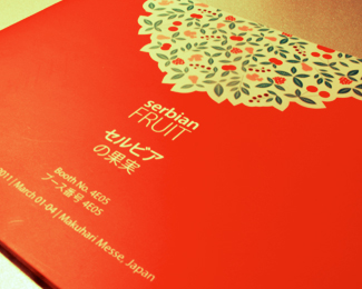
This is how it was presented on the brochure.
It's probably better option to go with that same trick on the logoponds format. Is it?
Status:
Client work
Viewed:
1743
Share:






Lets Discuss
Now I see where are you coming form, brochure looks slick.
ReplyEVERYTHING looks better in print. great work!
Replymilou, mike thanks!*I guess I should reupload the flat version of this in the way it appears on the brochure.*Cheers guys!
ReplyPlease login/signup to make a comment, registration is easy