Description:
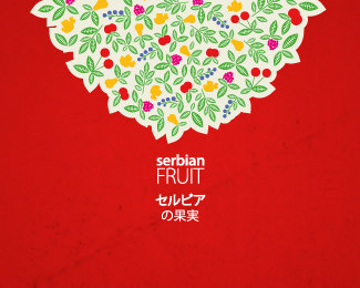
Third proposal selected by client.
Illustration together with the type both in english and japanese makes the image of the fruit tree.
Status:
Client work
Viewed:
1909
Share:




Lets Discuss
Why the type is so small compared to mark?
ReplyThis one really looks a little bit blurry scaled to this size, and that the type part is small. Please note that this is not just a regular logo with all standard demands that one should answer.*There were just two requests: to place it on the brochure coverpage, and on the wall of the booth on the fair. On that wall the type was about 40cm wide, so I must it leave to your imagination to picture how it worked in that size. *I can upload the pic of the brochure to show you how it was executed there.*Cheers!
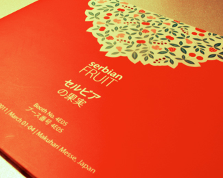
ReplyHere it is on the brochure here http://logopond.com/gallery/detail/132691*It will probably be better to make it that way here on the preview?
ReplyUpdated.
ReplyPlease login/signup to make a comment, registration is easy