Description:
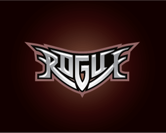
This was a proposed logo for boxing a promoter. One of my first attempts at this kind of symmetrical type logo design and I'm looking forward to doing more! Readability is of course always an issue with logos of this nature, but I'm pretty happy with the balance here.
Status:
Unused proposal
Viewed:
2784
Share:


Lets Discuss
In regards to legibility, I read it as %22ROGUE%22 immediately. Would have preferred that you not rounded the edges of the %22R%22 and %22E%22 where the serifs begin, but nice work regardless.
ReplyVery legible actually. My biggest issue are the trapped black space between ue and the terminations of the R and E at the bottom of the G with the little trapped neg spaces above and below. But very nice solution all together. Floated.
Replydefinitely see what you mean with the black negative space at the right. that bugged me for well over an hour. its like the logo has a hole in it.**nevertheless this logo was DOA, as the client thought it reminded them too much of a certain energy drink logo. Hopefully this type design is still good enough to convince someone that i can do more like this !
ReplyHey i realy like the logo work you do and am trying to get with you about doing some work please contact me clarkshapes@gmail.com
ReplyPlease login/signup to make a comment, registration is easy