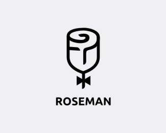
roseman
by george.wood • Uploaded: Mar. 22 '12 - Gallerized: Mar. '12

Float
(Floaters:
84 )
Description:
up for a wealth advisor | rose + man + question mark | and updated version http://logopond.com/gallery/detail/165495
Status:
Unused proposal
Viewed:
11948
Share:


Lets Discuss
love this little man too!
ReplyCool symbol! In my opinion the font could match the symbol better though.
ReplyLoving the icon, however the weight of the typeface could be a little bolder to match the strokes of the icon.
ReplyExcellent. I think the font needs to be bolder too.
ReplyClever concept!
ReplyExcellent concept, you should make the left eye curve like the right so it follows the curvature of the rose
ReplyBeautiful mark! I would agree with the font needing to be bolder.
Replygood job!*
Replythanks to @florisvoorveld, @bartodell, @occipital, @square69. i made some mending on the text, see if it will looks better. http://logopond.com/gallery/detail/165493
Reply@topiccreative, i have tried as you suggested, but the face didn't look like calm and wisdom in my opinion. thank you anyway.
Reply@garychew1984, @Paulius Kairevicius, @Nagual, glad you guys like it. thank you :)
Replysorry, its http://logopond.com/gallery/detail/165495
ReplySuch a gentleman!
ReplyJust noticed the face in the rose ! It's probably supposed to look like that ... it makes the whole logo even more brilliant !*
Replyvery creative :)
ReplyI love the concept, I think you have some angle issues to work on, the eyes angles are different and specially the left one I think if you follow the curved line on top of it will make it look more like a rose and help it to be more symmetrical. just my opinion, well done!
ReplyI see TP. Can't get this out of my head.
Reply@Daniel, @Yannick, @Bluroon, @ichik, thank you for the kind words
Reply@Rudy, one draft version of this was made as what you've suggested. the reason why i did not applied a curved line for the left eye is, the face will some calmness and wisdom if so. thank you for the advice.
Replyappriciated the advice, thank u @Jenn. pls. see the updated one. http://logopond.com/gallery/detail/165495#Occipital_165495
Replyunbelievable ... missed most of your work ... ashes on me ... great, great show ... love this piece, man !!
ReplySomeone is using your logo. Dunno if you've sold this to them or not.
Replyhttps://www.facebook.com/rosemanclub
Please login/signup to make a comment, registration is easy