minima
by lundeja • Uploaded: Nov. 13 '09 - Gallerized: Nov. '09

Float
(Floaters:
55 )
Description:
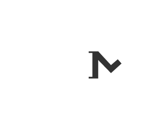
Nothing is really changing. I'm crazy in the coconut. Basically I'm like jekyll/hyde when it comes to the kind of work I do and I'm starting to think I need two sites/aliases to kind of separate those two worlds. Anyway long story short, I'll be using this alias for my logo design portfolio. This is mostly because of questionable articles that are on Google which are ranking for my real name. No big deal. Just thought I'd share in case you accused minimalogo.com of stealing my stuff at some point ;)
As seen on:
minimalogo
Status:
Nothing set
Viewed:
14919
Share:


Lets Discuss
very nice type Jared!
ReplyThe lowercase A really sets it off. Nice job.
ReplyLove this style, congrats! :)
ReplyJared this is some nice and clean typography set-up. I likeys.
Replylove you
ReplyGood stuff. Goes with name.
ReplyThanks all :)
Reply%5EHaha Sean. Nice work Jared.
ReplyHow come vertical and angled strokes look as if they have different weight ? Is it just a rasterization thing or is it intentional ?
ReplyI think it just output weird, but I just adjusted the size ever so slightly in illustrator and I think maybe it looks better now?
ReplyWell one things for sure at least, I've never had my face so close to a monitor before. You have a keen eye.
ReplyThat's much better. It's not a keen eye, it's the monitor gamma :)
Replystunning.
ReplyBootiful. The lower case 'a' really completes it. Nice stuff man.
ReplyThis gets better every time I see it, the type is great. Love the simplicity.
ReplyLove this guy! Great typography!
ReplyBeautiful, man!
ReplyPlease login/signup to make a comment, registration is easy