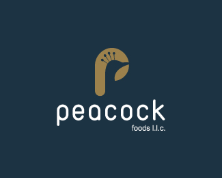
Peacock Foods
by tiko1232 • Uploaded: Jul. 26 '09 - Gallerized: Jul. '09
Description:
This is the one they liked.
Status:
Client work
Viewed:
17830
Share:

Lets Discuss
Great choice. The colours are nice too.
ReplyThanx a lot bad :)
ReplyThanx a lot buddy :) sorry, dun't know where I got bad from :s LOL
ReplyWho's bad? %3B)
Replyuhm, ah well, hmm ... me? :D
Reply%5E%5ELOL Mr Bad. Hey nice work Tiko, lovin it.
ReplyThanx a lot Mike :)
Reply%22Who's bad?%22 - I was just quoting the MJ song.
ReplyStill me though %3B) LOL
ReplyNice mark, tiko.
ReplyThanx a lot Roy :)
Replyreally cool work tiko! fantastic choice of colors, the mark is classic! Your client's very lucky to have gotten his hands on this beauty!
ReplyThanx for the kind words John :)
ReplyTiko brother.. this is a killer brand mark dude :)*keep them comming bro, doing GREAT %3B)***CHEERS
ReplyThanx mavric :)
Replystrong mark congratz
ReplyThanx a lot bro :)
ReplyNot bad at all
ReplyNice one, Tiko!
ReplyThanx dudes :)
Replyhey, nice work, man :)
Replythanx pal :)
ReplyNice design tikoo. Good job
ReplyI like the fact that you created a Peacock logo without doing the usual fanned tail image a la NBC etc.
Reply@ radhacleis %26 felro: Thanx a lot guys :)*@ BigAl67: Honestly this is how it started, but then I tried thinkin deeper thanx to the teachin of a great mentor, and I'm glad that a lot of people really like this (sniff sniff, I got a tear in my eye :P lol) thanx for the comment Al :)
Replylove it! :)
Replynice work man...
ReplyThanx dudes :D
Replynie man that's a creative work. Well done.
ReplyI love it :) good work Mahmoud!
ReplyThanx Konrad and Swabai :)
ReplyPlease login/signup to make a comment, registration is easy