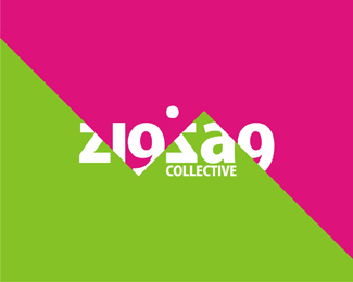
ZigZag
by tass • Uploaded: Jun. 02 '09

Float
(Floaters:
57 )
Description:
zigzag collective electronic music band, producers and djs based in Bucharest, Romania. inspired by a banner that the band had on their events where a zigzag line was cutting out their name written in a basic font (something like arial).
As seen on:
www.alextass.com
Status:
Client work
Viewed:
11525
Share:


Lets Discuss
I really like this Alex, great sense of space here. I wish you can cheat on the first G stem and just thicken that hairline a bit though. looks fantastic otherwise.
ReplyVery cool
ReplyI like this a lot. The line that isn't really even there has such presence!
ReplyThis reminds me of one of Nido's logos. http://logopond.com/gallery/detail/32537
ReplyYe, seems like we used the same tehnique. :) Interesting they were done in the same period of the year, a year ago. Thanks for the link it seems quite familiar, i think i've seen it before in the gallery or somewhere. **And thank you all for comments and suggestions. :)
ReplyWhat an extraordinary coincidence. %3B)
Replypersonally i like this one better... i think its an easier read, plus the zigzag cut through the type is directly associated to the company %22zigzag%22... nice work
Replythanx nattiemon
Replygreat design mate
ReplyThank you Rich!
ReplySuperb job tass!!
Reply%22Ye, seems like we used the same tehnique. :) Interesting they were done in the same period of the year, a year ago. %22**... yeah interesting... yours a year ago too huh?... is that just your word mate?... im happy to be proven otherwise... just feel that %22done in the same period of the year, a year ago.%22 alone don't cut it...
ReplyHey there, and thank you all for your opinions.**@Nido. I feel a bit of acidity, quite a lot of acidity in your comment. The zigzag logo project started in august 2008 and was finished in september same year. Yours was uploaded in June so that gives you at least 3 months ahead. If i was considering ripping your work do you think i would leave you a comment with it on you project page or even considering uploading it here? **I'm trying , as i guess all of us here, to evolve in this field and make a name of it. It happened before %22once%22:http://logopond.com/gallery/detail/61141 or twice to be accused of having similar concept logos, and all i say is that i am sad that this happens, to remark people had similar ideas with mine, or that i had similar ideas with them. I am really sorry if you think otherwise / something else.
Replywell to be fair mate I ain one to jump on peoples designs %26 start accusing them of %22rips' especially when it comes to mine... I'm just too lazy for that... but, I will say that (%26 I'm again not saying you ripped me) to just simply dismiss it with a statement like %22oh well... mine although posted almost a year later was actually done at the same time... wow.. what a coincidence%22 just ain good enough regardless of who you are... especially without even attempting to then provide any evidence... I could easily create something similar to what's in your showcase, post it tomorrow %26 say it was done last year %22:D%22... %26 posting a comment on my logo here doesn't prove anything either... if anything it allows you to say %22I wouldn't have done that if I ripped you%22 later... which you kinda did say.**I'm all cool for being proven wrong, heck, I don't even care... just flippant remarks like %22Ye, seems like we used the same tehnique. :) Interesting they were done in the same period of the year, a year ago.%22 rub me up the wrong way, cause it's just your word.
ReplyI see your point of view and that my explanation made you doubt even more. Sorry for that, my bad. I was not trying to dismiss anything, and i'm not denying the similarities. I am not trying to diminish you or your work in any way, au contraire i do respect you and your portfolio, i like quite a lot of your posted projects, again that was not my intention.**To be sincere i don't even know how to react in this kind of situations. A first thought was to remove it, but that can be easily interpretative. An answer that %22i didn't...%22 again doesn't help. And again this kind of situations give me a very sour feeling.**I'm noticing that every day in many places things that look alike appear, and i am extremely upset and sorry to be put (even in a subtle manner) in that light. I do hope you understand my position too.
Reply%22I'm noticing that every day in many places things that look alike appear...%22*Like this for instance ... %3B ) http://www.nocturn.ro/identity/1stofmay.html*And the original ... http://logopond.com/gallery/detail/9507
ReplyI must thank you Neil for your ironic comment... But exactly! I didn't post that because i knew ocular's logo and i was aware that speculations might appear. **My idea came from an %22iphone application%22:http://www.macworld.com/appguide/app.html?id%3D95268%26expand%3Dfalse with %22larger details here%22:http://images.macworld.com/appguide/images/291/430/689/ss1.jpg and you might admit that is quite a common visual (%22retro clocks%22:http://www.newlaunches.com/entry_images/1207/05/Retro_Flip_Down_Clock_1-thumb-450x447.jpg often seen in american movies for example, that has even a bit of %22airport alike style%22:http://www.nocturn.ro/identity/homm-popoviciu-interstate.html).**Any other logo to be blamed?
ReplyI think its unusual how quick some designers are to sling accusations at each other. I'm not specifically referring to this incident, but it seems like people are extremely eager to call others a plagiarizer. I think you have to make that judgment call based on experience. If two professionals perfectly capable of designing their own work have a similar idea...maybe they just had a similar idea. I don't think guilty should be the first assumption until further questioning.
ReplyOh, and great mark.
ReplyTass, sorry for the sarcastic link (my bad) You explained it's origins, I understand these things happen. I just feel in situations like this its better to be respectful of the designer in question and converse. Apologies.
ReplyI am sorry too for over-reacting in my long comments. I do hope that my portfolio proves better than my words that i do my best to be original, and i mean it when i say that i am more than sad when i see that someone else did that before in a more or less similar way, and these kind of situations (when people compare them) give me very harsh times. No problem Neil, i am not upset on anyone, i must thank you and everybody for understanding and support, and i do hope in a more active feedback on my other projects as well.
Replyhow it is not in the gallery
ReplyI think that because there are other similar concepts out there, so it's not that unique (read the comments above). **Thank you for the comment thou.
ReplyPerfect work Alex!
ReplyVery unique approach, Alex. I like it a lot.
ReplyThe classic masterpiece
ReplyGert, Peter, Nick, Aleksandar, thak you so much!
ReplyI've been biting my tongue on this one. I can't but help see the attributes in the above mentioned logo though. It's a hard one to swallow for me, even though it can happen I guess.
ReplyThe same attributes.
ReplyHey Mike. I really understand what you mean.
ReplyQuestion: how original and unique do you see my bat to be? I have lived for years with the idea that there's nothing like it out there until one day people start sending me emails about a rip off. The symbol was similar almost to the last line or shadow. I was 100% sure that it was a theft until he provided me his sketches and options moment in which i've remained speechless seeing how even thou he had a completely different path that i had he got to the same conclusion.
The bat situation hurt me the most because it is my main identity thou... but there were other situations too, like this one for example, or like a wine project showing bottles and glasses in a negative space, one of my first logos that I was extremely enthusiastic with until I found Logopond and later Raja's work with a 100% identical concept just reversed.
It's difficult and unpleasant and I don't know what to say more or what is the correct attitude. Should i have removed this logo or any other logo with similar problems from my portfolio? And what would have this symbolized? Should i have changed my bat because somebody else got to that result?
No problem, i understand.
ReplyPlease login/signup to make a comment, registration is easy