ATACK
by Logomotive • Uploaded: Apr. 28 '09 - Gallerized: May. '09
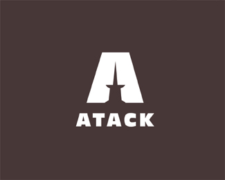
Description:
this has probably been done before?
Status:
Nothing set
Viewed:
28934
Share:


Lets Discuss
ive never seen it, very cool tho mike, great job
Replyagreed with Sean
ReplyThanks guys, put I imagine it's been done. Maybe not as Attack but the negative space most likely.
ReplyI knew this one was yours before seeing your name. Great like always
ReplyStrong as always, Mike. :)
ReplyNicely done Big fella!
Replywow, this one hurts !
ReplyCheers guys, thanks for the comments.
ReplyVery cool. Why the spelling of attack with only 1 't'?*
Replylol..take a look again..A tack...get it:)
ReplyA tack, cool man
Reply%5E%5E yep it's just A Tack.
Replyyeah i like this one better. Looks like a sword as well as a tac. :)
ReplyI never saw it either
Replylove it*
Replyme to %3B)
ReplyFirst of all, since english isn't my first language i didn't know what a %22tac%22 is. but my first impression was %22that looks a hell of alot like a butt%22.... **However, when i learnt what it was is made alot more sense and looked alot better. %3D)
ReplyThanks all.*@heniv81 ha ha, I guess people have been at attacked in that position too.* *The whole concept was more geared towards attacking a job or task such as business therefore the tack as in tack it up plan.
ReplyOUCH!! I'm having a letter atack, get me some aspirin. Great idea, kudos.
ReplyGreat Work.*%3Ca href%3D%22http://wholebodyvibrationtherapy.net/%22 style%3D%22overflow: hidden%3B text-decoration: none%3B width: 50px%3B background-color: %23F3F3F3%3B display: block%3B float: left%3B text-indent: 1000px%3B white-space: nowrap%3B%22%3EVibration Traning, Vibration Platform, Vibration Therapy, Power Plate%3C/a%3E
ReplyFunniest logo ever! :D
Replynever seen this before too! brillant work. Easy to read when it's very small, good point!
Replycool logo - very funny :D , you'are great !
ReplyThis needs to be a fixture to the frontpage Gallery. I laugh out loud every time I log in :)
Replyvery nice! loving the depth of the mark!
Replyhaha maybe my dirty mind took over.. but at first glance I thought it was a bare butt...**Great job though!
ReplyI saw the top of a submarine, works well
ReplySee guys, it has multiple meanings for A Tack %22Attack%22 getting a kick out of the different %22point%22 of views :)
ReplyWell... it looks like an ass. %3B)
Reply%5ELOL Im seeing an ass aswelll...
ReplyIt's a Crack Atack! (sorry to be a butt, Mike)
ReplyNice to hear! Glad you all like butts too.
ReplyHa ha! I don't even recall posting that. Jeez.
ReplyPlease login/signup to make a comment, registration is easy