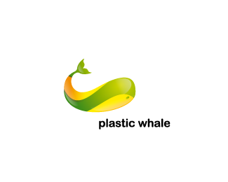
iPhone App logo
by brandberry • Uploaded: Apr. 13 '09

Float
(Floaters:
106 )
Description:
Fish with V letter in its stripes
Status:
Unused proposal
Viewed:
23628
Share:


Lets Discuss
Absolutely gorgeous.
Replyhonestly, i'm so mesmerized by the fish and the colors that i almost don't notice the V (that's a compliment, i think :P)
ReplyWow. That's like in-your-face memorable. Superb.
ReplyThe colours are amazing, good work
ReplyVery nice looking!
Replyspeechless!!!!!
ReplyWHOA!
Replywow. beautiful illustration!
ReplyWow.
Replygreat illustration! congrats.
Replylush
Replygreat!
ReplyAbsolutely amazing.
Replyyes great use of colors, great job!
Replylovely colors,brilliant !
Replylovely done
Replyklaaaaasss!
ReplyEye candy %3B-)
Replywaaaoooo
ReplyThank you guys!
ReplyAll the above except the %22Thank you guys !%22 %3B)
ReplyYeh that is one good lookin fish.
ReplyYep, it's pure eye candy.
ReplyI was sure this one goes straight to the front page...%0D*Maybe because this fish is lonely without any type beside him? i've never seen a logo on the Logopond gallery without type.... so maybe thats the reason.. anyway like i said before, AMAZING!
Replyit's so nicely done!!
ReplyReally nice work!
ReplySSSSSEXY!
Replywhich app?*
Replyhow good is this?! wow
Replystunning
ReplyPerfect for its application as an App icon. Gorgeous.
ReplyI love the colors in this one. Can't believe it's not in the gallery!
Reply%5EStill believe that :)
Reply%5E The no type rule in effect.
ReplyA very lame rule!
Reply%5E%5EIs this something that can be changed? Seems a lot of the designers share the same view regarding the %22no type, no gallery%22 rule...**David?
ReplyI am sure you disagree with David, JoePrince. But, I personally support his decision to not add an icon-only design to the gallery. To say change that rule is to say, in a sense, that logos don't need words or type to be effective. Which I believe is incorrect, and gives too much credit/attention to the graphic itself. How many times have you seen unbalanced designs make it in the gallery -- graphic-heavy, type-poor? This would be more of the same type of direction. I come to this site to see great examples of completed, effective designs and I tgink to change that would be a detriment. And yes, of course, these are my opinions. I welcome you to feel free to disagree with me...I'd like to see more discussion on this.
ReplyI would love the Apple and Nike logos to be posted and to be consigned to View All forever.
ReplyThey've been branded, heavily...before theycould be recognized without type. And when they were branded -- first shown to the public -- they had type, Firebrand. Branding needed type before icon-only recognition was even possible.
Reply%5EThank you for sharing Roy, completely agree with you.*@JF, although some designs in the gallery may not be %22gallery material%22 in terms of graphically unbalanced, that is besides the fact. On the other side, if type-only designs (wordmarks) are allowed in the gallery, then how is it reasonable to say that mark-only designs should be discouraged from getting the attention they deserve on the front page. If a designer produces a beautiful piece of art, such as this one, and the client requests to not have any type with it, then how is it fair the designer should not be recognized by any possibility of having it featured in the gallery?
ReplyWell, I like 'pretty.' I like this design a lot, too. But 'pretty' is not the reason why a logo is defined as effective. I believe art and logos aren't the same thing. A logo conveys a complete message, JoePrince. It's a communication piece, not an art piece. And without text, it's an incomplete message. The exception to that rule is companies who have invested millions, perhaps billions of dollars and countless comnercials....where the name is spoken aloud so much the name doesn't need to be written -- because the name has been communicated verbally. **But in those cases, the name has indeed been mentioned already. A new logo sans type or name-verbalizing just doesn't do its job, in my opinion.
ReplyDid you take down your showcase JF? I'd like to see more work from you.
ReplyI did indeed take it down awhile ago. Never really had much there, and I was putting up WIPs -- not finished projects -- I came here to get feedback from other designers before finalizing. And, due to my fears that the work I eventually to care about would be shamelessly ripped off from this site, I took my work (however incomplete that it was) off pretty much as soon asIhad received the feedback I needed. **Currently developing my personal site to be password-based, permission-only. As I'm not the uber coder I wish I was...it's still in development. Also investigating new programming languages (jQuery for example) that will work better than Flash for me...though Flash is something I love. When I feel my site is up and decent, I may let the world see more of my work.
ReplyUgh, typing too fast...sorry about the typos.
ReplyHi guys, you have good conversation here :)
Reply%5E :D
ReplyDavid...still waiting to hear what your thoughts on this are. Seems to be a topic of discussion on the Pond.
ReplyHas to be amongst the most interesting topics on the pond. I'd love to hear more thoughts on this. I personally tend to agree with JF's point of view, but it's obvious that everybody stated solid arguments.**This is indeed gallery material just for the beauty of the execution, I, however believe that illustration-only designs don't suffice for identity. Monograms - yes, unique marks - yes.**If i was to see this illustration on a magazine cover, on a billboard, on a car - i would definitely guess it's part of the design, composition, not a logo. Apart for the barely visible V, this doesn't really tell anything in terms of identity, apart from the glossy effect which leads me mostly to Apple related products.**As for the Apple and Nike logos, I see where you're going Roy, and you're right, but let's think of it this way: if you were shown the Apple logo BEFORE you knew what Apple is, would you still find it that strong? Would you even think they sell computers? same thing applies for Nike too. In this case, I believe it's branding work all the way, like JF pointed out.**That aside, let's not forget that this is a Iphone APP logo, and I think brandberry has done a wonderful job. I was referring to logos and identity in general.**So, I firmly believe that for some marks (or illustration-marks) type is mandatory in order to stand as identity pieces.*
ReplyI hate it when paragraphs are ignored, my comment looks like a block of random characters, lol.
ReplyI'm a newbee to the pond. I had no idea there was a 'must have type' rule for the gallery. I'll keep that in mind from here on out...That said...A logo is a symbol that represents an organization or product. There is no rule that states that it must be accompanied by words to be considered a logo. The holy cross is a logo that represents Christianity. I'm pretty sure that it was established sans-type........Now that I have defined %22logo%22....The %22V-Fish%22 represents an app. What app? I'm not sure, brandberry didn't say...but we DO know it represents an app......Perhaps the rule should be: LP will only consider it a 'logo' if the brand it represents is clearly stated somewhere—whether it be presented as part of the artwork, or in the logo description.%22 My head hurts.
Replyeach logo is required a type, even Nike and Apple, logo for recognition must be typed.
Replywooooooooooooow very very very nice :o)
Replygo on!! one more makes 100. wohoooo!!!
ReplyMine.
Replyonya!
Replydalmatians.
Reply%5Eha!
ReplyStunning!
ReplyDory has a new look
ReplyPlease login/signup to make a comment, registration is easy