Kodespark
by Kode • Uploaded: Dec. 17 '08
Description:
This is a personal branding project.
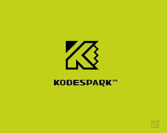
KODESPARK™ is my online portfolio and design studio trademark.
I created the mark by combining the letter K + Pencil tip.
I created the typeface completely from scratch, and I really like the way it turned out!
The mark also fetures sharp angles, smooth lines, and perfect symmetry or at least I hope it does, this was my goal!
I would really appreciate your feedback on this!
As seen on:
Kodespark
Status:
Nothing set
Viewed:
1897
Share:

Lets Discuss
This is a WOW*really nice :)
ReplyThanks *Bandar*, that's very nice of you!**-Kode
ReplyNice mark, and nice typo!
ReplyI really like it, though the 'R' seems a little munted. *good job though.
ReplyThanks *geniuslogo*.**Thanks for the feedback *indiview*, the %22R%22 was sort of an intentional:-)
ReplyPlease login/signup to make a comment, registration is easy