Description:
This is a personal branding project.
KODESPARK™ is my online portfolio and design studio trademark.
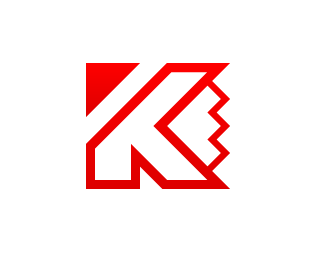
I created the mark by combining the letter K + Pencil tip.
The mark also fetures sharp angles, smooth lines, and perfect symmetry or at least I hope it does, this was my goal!
I would really appreciate your feedback on this!
As seen on:
Kodespark
Status:
Nothing set
Viewed:
1749
Share:

Lets Discuss
looks awesomely nice. It must've been a hell of a job (4 years)
ReplyThanks *Matheus*, that's very nice of you!*Yeah, it was a long off and on process. I'm very picky, specially when I design for myself:-)
ReplyThis is very clever logo, it looks really nice on your site too!
ReplyThanks for your kind words carlos and thanks for stopping by my site!
ReplyPlease login/signup to make a comment, registration is easy