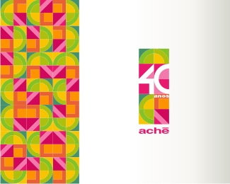
Sidarta (2007)
by sebastiany • Uploaded: Sep. 19 '08 - Gallerized: Oct. '08
")
Float
(Floaters:
49 )
Description:
School | Cotia | SP | Brazil
As seen on:
http://www.logotype.com.br
Status:
Client work
Viewed:
15939
Share:
Lets Discuss
beautiful mark!
Replyi love it!!
Replythanks!
ReplyVery nice!!
Replythis is absolutely brilliant.. well done seb..
ReplyWonderful work Sebastiany!
Replythis logo is really innovate
ReplyIt would make a great Olympic bid logo.
ReplyGreat shapes. The negative space works brilliantly.
Replythanks all!!! The dificulty was that the old logo was already a child figure... most like many other schools and ONGs do... nothing original at all. But the client wanto to keek the human figure in the logo. The dificulty was to do somthing original with that.
Replynice)
Replyabsolutely love the mark. Type is not really convincing (for me)...
ReplyBrilliant!
ReplyBeautiful mark. The way you used the negative space is freaky good.
ReplyI love how the figure looks like they are reaching out to put their arm around someone. Nice touch Seb. Nice vibrant logo, like the Brazilians themselves.
ReplyThank you C4! This is the work of my entire team.%0D*%0D*Some people say that looks like a kid running with a big green ball in his arm
Replysee also a sub-brand: %22link text%22http://logopond.com/gallery/detail/41525
ReplyGreat work. Really like how each of the coloured elements of the icon are strong and well balanced images in their own right... making them combine to create the figure in the negative space is outstanding.
ReplyJust to give credit.... Were involved in this project the following designers: Akira Goto, Camila Vieira, Guilherme Sebastiany and D%E9ia Kulpas
ReplySebastiany,*Realmente a logo ficou impressionante. Quando olhei para ela na galeria li o nome col%E9gio e logo cliquei para conhecer mais detalhes. Assim como o garoto estilizado com um bola nas m%E3os, talves correndo, vejo tamb%E9m o C em sentido inverso ao da leitura e um s tanto cortando o trecho amarelo quanto o azul.**Parab%E9ns a toda a sua equipe cujos nomes est%E3o citados acima. *Devo come%E7ar a postar meus ultimos trabalhos em breve e gostaria de contar com algums coment%E1rios. **Um forte abra%E7o e mais uma vez parab%E9ns.**You've done a great job!*
ReplyThanks sebastiany, I didn't see the ball at first. Now that I do, it really stands out and makes sense.
ReplyObrigado Nymest. Vou comentar sim!%0D*%0D*C4: thank you again, but the %22ball%22 was not intentional, just a happy coincidence.
Replysebastiany your logo is oddly similar to the Vancouver Aquarium logo !!!!%0D*%0D*%0D*rare coincidence, even the composition. anyway, this things happens.
ReplyAnd again, smart use of negative space.
ReplyNice mark, but it looks like a parrot to me... the colours, the yellow beak…
ReplySou fanza%E7o do trabalho de voc%EAs!*parab%E9ns!**Abs*Daniel Campos - LogoBR
ReplyObrigado / Thanks all
ReplyPlease login/signup to make a comment, registration is easy