DL monogram
by SKitanovic • Uploaded: Sep. 08 '17 - Gallerized: Sep. '17

Float
(Floaters:
27 )
Description:
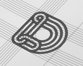
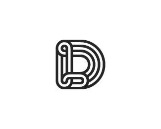
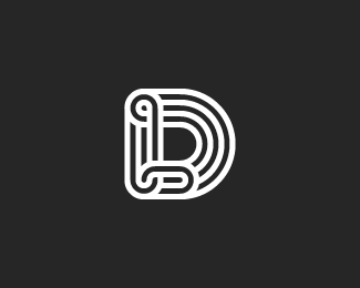
One of the logo proposals that I have designed for the law firm.
A modern and elegant logomark, which at the first site looks like "D'' letter, but actually it is a monogram that consist ''D'' and ''L'' letters (company initials) which are connected and ''chained'' one to another.
They have decided to go with much more simplified version of this monogram, which also looks good.
But, I'm presenting this one as my personal favourite option from this project.
As seen on:
dribbble
Status:
Client work
Viewed:
6130
Tags:
•
geometric
•
typography
•
DL
Share:


Lets Discuss
Please login/signup to make a comment, registration is easy