GRUNDFAKTOR
by OcularInk • Uploaded: Mar. 18 '08 - Gallerized: Mar. '08
Description:
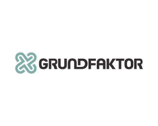
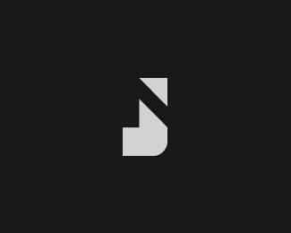
This is the new logo for GRUNDFAKTOR. GRUNDFAKTOR is a multi-creative studio offering creative services which include fine drawing, image editing, composing, web design, web programming and much more. Sebastian Brauner, owner of GRUNDFAKTOR, wanted his logo to be bold, abstract, with a subtle corporate feel to it. A clean bold type created from scratch has been paired with an abstract and bold icon. The icon is also a combination of several G-like shapes. :: Featured in Logo Design, Volume 2 ::
As seen on:
GRUNDFAKTOR
Status:
Client work
Viewed:
14534
Share:
Lets Discuss
WOW! Doc Oc is breaking out the big guns with this one! Nice work man!
ReplyIt's got real presence this one, doc. Nice work.
ReplyThanks for your great work. I am so happy of my new logo :)
ReplyThanks Bart and Roy. :-)**Loved working with you, Sebastian. Cheers!!
ReplyVery nice. The symbol has an ancient feel to it which I really like. Combined with the nice modern type this is a nice piece. Though the R's seem a little unbalanced in weight compared to the other letters.
ReplyI like the logo quite a bit, but I agree with art machine, the R's seem a little heavy. If the tail of the R were a little thinner and the bowl a bit thicker, the letter would balance nicely with the rest of the type. Love the mark!
Replygood work!
Replywell done Kevin!... i especially admire the type work!
ReplyI love the the type i think it will work whitout the sign
Replynice stuff kev
ReplyHoly cow. Thanks, guys. :%5ED
ReplyI properly love this mark! Awesome! Not as keen on the type - though it could just be the way it's rendered at a small size. Think the right hand part of R might be the prob.
ReplyThanks for your feedback, Owen.
ReplyGreat work!
ReplyNow that's hot. Love the simplicity of the mark!
ReplyThanks for your kind comments, Raphael, Nima, and Mabu.
Replysimple and smart Kev!
ReplyThanks Rich. Hope you're doing well, dude.
ReplyThis is beyond cool.
ReplyThanks JF!
ReplyI just bought __*Logo Design Volume 2*__ and was very pleased to see a lot of logoponders' logos in it. I'm proud of you. :)
ReplyThanks Julian. It's great to hear from you!!
ReplyPlease login/signup to make a comment, registration is easy