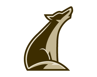
Coyote Full
by bartodell • Uploaded: Feb. 01 '08
Description:
A coyote logo-mark I am working on. Typography to come.
Status:
Nothing set
Viewed:
8365
Share:

Lets Discuss
great mark...clean and simple. :)
ReplyThere hasn't been much comments on this one yet Bart because we're all speechless :)
ReplyThat could be a good thing, but then again it could be a very bad thing! :)
Replyjust waiting for the type bro. Of course it's a good thing.DUH
ReplyType is going to be the scary part. LOL. Thanks MikeE. Means a lot coming from one of the illustration logo masters!
ReplyLOL... im scared for you Bart... this is that good im dreading the type!.. no doubt you'll pull it off.. but the suspense...lol
ReplyNot that you're putting him under pressure or anything %3B)
ReplyIt is coming fellas. Just have to get it approved first.
ReplyI never meant to criticize you about that Phoenix Coyotes thing. Only when I saw the head-only version this was the first thing that came to my mind and I thought I'd let you know.**Actually I think your Coyote logo looks great (although I prefer this one, the one with the full body). It is very clean yet detailed and very nice work. I wish I could do that...
ReplyThis is one of my favourites... few lines, 3 colours, GREAT IMPACT AND SIMPLICITY.*Well done!
ReplyLOVE--- !
ReplyJust got the email this logo was selected for LogoLounge project, %22Animals and Mythology%22, the second book in the new Master Library series.
ReplyCongrats Bart - well deserved.
Replycongrats!
ReplyIt's beautiful.
ReplyPlease login/signup to make a comment, registration is easy