Taste Tuscany
by Supamario • Uploaded: Sep. 25 '15 - Gallerized: Apr. '17
Description:
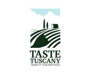
my second project for my graphic design class is make a logo for a restaurant. I choosed a italian restaurant serving authentic tuscan food. After researching alot about tuscany two things that people said that brought to mind tuscany was the very beautiful rural landscape with vineyards and hills, i used the hills from tuscany simplifying them into simple forms and then i noticed the prongs of a fork could be fit snug into the shape of the hill very subtly. thinking of naming the restaurant "Taste Tuscany" tasting food isnt just about tasting the food itself but taking in the atmosphere of the tuscan countryside.
As seen on:
N/A
Status:
Work in progress
Viewed:
6436
Tags:
fork
•
hills
•
italy
•
tuuscany
Share:


Lets Discuss
Neat idea. Now work on execution. Lines need some adjustment, typography - a lot more
ReplyI think there is some problem with the perspective, the hills are too high. If the fork would be more horizontal ypu could get rid of these additional lines, I think that shoul clarify the view a made it more simple. Check this out for an exemple: http://logopond.com/gallery/detail/227952
ReplyTypography needs some work as logoholik said. Hope it would help.
Yes pixel crook thats what was wrong with it!
ReplyThat's much better, but you should still need some work on details. I think the lines between the fork's spikes should more parallel to bottom line. These two lines in the back of the scene I think it should be in a oppsite direction as it was inn the previous project, that would be the contrast for the monotony in the lines direction. The house is too childish in my oppinion. But you're heading in right direction. Work on it, I'm curious what will be final result :)
ReplyI like the idea , the home , clouds and sky i think are very similar to a logo of " Sam DeMastrie " i think it was " south ogden " ,
Replybut i like very much the idea of the fork , but try working more with the lines , make it more symmetric and simple , so people can recognize the fork better , also this is a logo for food , i think the typography needs to be more " Warm , simple , " and the word " Tuscany " make it all capital letters , or lowercase , i think this would be better.
Thanks
Interesting i didnt know about that logo from Sam, is there any way to simplify a House without it looking like that, Was Just trying to simplify the House and the clouds. As for the fork , i cant see what would make this thing more symmetrical but i'll see what i can do . thanks
ReplyDon't get attached to this, try to play some more with it. I think it's still not to the top. If I may ad something more, I think those two lines parallel to the fork are unnecessary. If you get rid of these, try to lower lines in depth. That would differentiate the hight of the hills, which make scene more dinamic. Also the clouds seems to static, I would try to move centroid more aside. Typography should be more extended. Now it makes logo so vertical, I think the proportion of the logo should be more or less 6x9. Keep it up!
ReplyThanks pixel crook dont worry i will only be satisfied when this logo is at top of the line quality. To clarify when you say lower the lunes in depth does that mean using color warms to cool or by size largest to smallest the clouds should not be centered and should be to the side or should i Just have random clouds floating in the sky. Again thanks for the encouragement and help
ReplyOh, I ment lines :) And I was talking about that hill on the left. I think if the top of the hill would be lower, it would expose more the hill with the fork. With the clouds I thought there should be for example more blue sky on the left side. It would arrange the scene in three more or less parallel stripes, green on the bottom, white in the centre and blue on the top. Hmmm, that's almost like flag of Italy, maybe try to make the sky in some red colour, to see how it looks :)
ReplyDo you have any advice on how to execute the House and clouds. Its looking too much like this http://logopond.com/gallery/detail/226727 im not very confortable having my work look like another, no offense to sam.
Reply^ I don't think you have anything to worry about.
Replythe clouds i tried doing the way you suggested pixel crook but i kept coming back to this, as think it looks better, the red color looked weird so that was a no go. i darkened the color of the hills more to stand out and lowered the left hills to make it look more dynamic and changed the typeface into a more old style serif typeface.
ReplyThe Idea is very good. Those two extra Lines are important because for the Symbol of Landscape in my Opinion. The only Thing I would try here is to make the Fork more stand out, to make the extra Lines more transparent, a bit.
ReplyThanks for the critique I already finalized this one but I haven't put up the final version with all the improvements yet.
ReplyPlease login/signup to make a comment, registration is easy