Description:
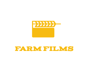
using the film clapper stripes to make a wheat symbol. this could be used for an agricultural filming company that documents the lives of farmers.
As seen on:
N/A
Status:
Work in progress
Viewed:
3931
Tags:
agriculture
•
wheat
•
farm
Share:




Lets Discuss
Do you guys get the concept,i thought it maybe to far of a reach but i used the film clapper pattern to make a wheat symbol
ReplyYes, I get it, I have a similar idea in my showcase. Perhaps flip the wheat and have the stem at the hinge end only? (so it won't need to protrude from the right side). Maybe type could integrate better?
ReplyFirebrand thanks. The one in your showcase is the norfolk agriculture show one with the wheat turning into birds , brilliant. As for the type whay would you suggest. i was trying to get a farm feel/,film feel to the type so i picked this typeface it has serifs that match the strokes of the wheat.
Replyhttp://logopond.com/gallery/detail/67684 oh i see you did before oh well, really thought this was an original idea, i guess great minds think alike haha
ReplyNo worries, just about everything's been done before. Don't mind the font, I meant the type/mark lock up could be tighter.
ReplyI agree about the lockup. If it was me, I might try putting "films" under "farm" and centering and justifying the whole lockup. I'd also move the type up so that the space between the type and mark is equal to the height of the letters.
ReplyI got the concept straight away. If I could make a suggestion, it would be to flip the wheat symbol horizontally and make it the same length as the clapper. See how that looks.
ReplyPlease login/signup to make a comment, registration is easy