Logopond
by itsLeeBoren • Uploaded: Jun. 09 '15


Float
(Floaters:
7 )
Description:
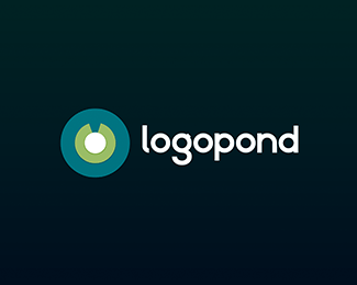
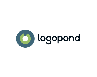
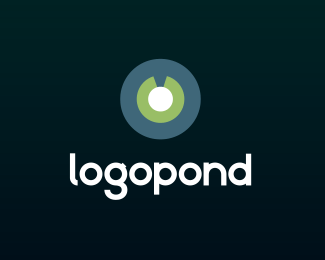
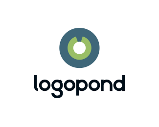
Just thought Id throw a logopond logo out there. I thought it was so cool seeing all these variations of the same brand from so many awesome designers.
I tried to pay homage to the original logo.
Used the same color palette ( with some slight changes ) Also included one altered version.
Completely custom typeface with inspiration from the original.
When creating the type I used the lily pad and flower circles and scaled them down 50%. From there I used that shape as the base for the entire type.
From the very first concept I knew I wanted to incorporate the water to show the pond in a sense.
Hope the community likes it. This was a lot of fun to work on.
Status:
Just for fun
Viewed:
1446
Tags:
for fun
•
concept
•
rebrand
•
WIP
Share:


Lets Discuss
This is solid.
ReplyThanks Sam! Really appreciate it.
ReplyPlease login/signup to make a comment, registration is easy