Aerogram Iconic & Geometrical Logo Design
by kairevicius • Uploaded: Oct. 08 '13 - Gallerized: Oct. '13
Description:
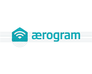
This is approved Aerogram Logo Redesign. Originally it looked like this: http://goo.gl/mVSyV0
As seen on:
Portfolio
Status:
Client work
Viewed:
13258
Tags:
minimal
•
clever
•
identity
•
designer
Share:





Lets Discuss
i've already said this, but that mark is brilliant, paul.
Replyagree, mark is very nice, kerning is off.
Replywhat a great mark. simplicity and depth. love it.
ReplyLooks very clean and nice
ReplyYeah, I tried to Like it on facebook, but facebook said I was too fast at liking it or something like that. Weird! Oh well I LIKE it a lot :)
ReplyJust so you are aware...and I am not saying you copied it. But this is an exact icon available in the Pika font by Symbolset. http://symbolset.com/icons/pika
ReplyIt's a brilliant mark but I've seen it in other icon sets, too, unfortunately, not just this one.
Reply^ But Paul didn't know this, it's an existing design he redesigned which he states up in the description.
ReplyI did not see it on there??
ReplyThoroughbrand, I saw the icon you're referring to (8th column, 3rd one down on the large set preview) and -exact- isn't really the word you're looking for. If anything, it's nothing more than a similar concept. The execution isn't even close to the icon on that website and I have to say, this is a much better execution of that concept.
ReplyI'm confused. Who designed the original?
Replytabithakristen, you are correct this is a much better execution. Saw the icon and instantly recognized it. Maybe exact was a poor choice of words, but close enough that with such an easily accessible font the designer could see a lot of rip offs. Most people wont notice those subtle details. Just thought the they would want to be made aware.
ReplyThank you for your comments guys. Originaly logo was designed by another designer. My client simply asked me to redesign it, so that's what I did. Can't take credits on creating the brand mark idea.
ReplyKudos ^
Reply^ Agree, the redesign is awesome.
Reply^ I think so too.
Reply^ me too me too.
ReplyYou made me smile fellas! :) Cheers
ReplyWoohooo...very simple :) great dude
Replygreat logo
ReplyPlease login/signup to make a comment, registration is easy