Logopond
by LPAdmin • Uploaded: Sep. 26 '13 - Gallerized: Sep. '13



Description:
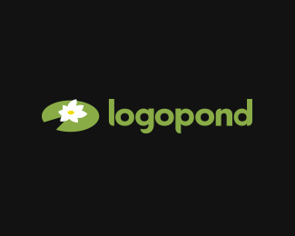
As a nod to Nikita via Roko, used his flower as the middle (stamen I think) in the redesign of the logopond logo I had been working on. Will upload the entire piece in a bit
As seen on:
logopond.com
Status:
Work in progress
Viewed:
12953
Share:




Lets Discuss
I saw the logo already in the site and looked really good, it is now back to the old one, I like the revised version Dave.
ReplyI agree this is a lot better. Clean and simple.
ReplyMight be stuck in your cache just do a hard refresh
Reply...and here it is again...looks good Dave, maybe the type could be a bit smaller.
ReplyIt carries much more load compared to the mark right now IMO.
In my opinion this logo, perhaps a sketch, has a poor graphic quality, because there's no oder in the lily and the slit looks far too wide. I strongly believe it should be geometrically and visually perfect like a piece of jewelry: http://logopond.com/gallery/detail/204376
ReplyNikita rights. His version is better and cleaner.
ReplyClimaxDesigns, look at this http://logopond.com/gallery/detail/204663
Replyi like ru_Ferret logo
ReplyI`d go with what Nikita did. :)
ReplyI have to agree with Nikita also.
ReplyMy vote for Nikita too.
ReplyI respectfully disagree guys and heres why: - also carlove logopond.com/gallery/detail/204663 I really like his view of it - however I think in both cases the perfection of the it is the downfall of it. If you look at images of lillypads from which I pulled my inspiration they are not perfect, the flaws give them character. Perfect alignment of the petals almost makes this forgettable.
Reply'Certainly fits in with the current flat, simple design standard that seems to be making its way around everywhere (that's a good thing)', I also don't want to settle this into any type of trend that may or may not go out of fashion in a few years, while obviously logos can change over time I created this with an eye towards being more timeless, I strongly feel that what Nikita has created will feel dated sooner rather than later.
Don't get me wrong his work is beautiful, but again in logo and identity design - for me anyway - its the those little flaws, those slightly off kilter feelings make a logo more memorable, more endearing, logo design is not able who can created the prettiest picture sometimes, its about problem solving and sometimes the solution to the problem is not flawless, the problem with the old logo was that it was far to complex and needed simplification.
My solution simplifies the old version but doesn't move it so far down the road that you forget what the previous one looked like, I absolutely loved the look of the old logo and don't want to push to far away from its look and feel which I think this does.
I will play with the alignment of the petals and the gap of the split, but this is the new design folks! any suggestions on how to make this better (besides replacing it with Nikita's :D ) are more than welcome. Will upload an update in a few
Your logo David looks good, I like it. But in my opinion Nikita's logo is better. Minimalism is timeless and logo Nikita doesn't get old. It's a clean, simple and well thought out design. I don't see anything in it of accidental. It has beautiful geometric shapes.
ReplyBut of course, you're the boss! :)
You can't criticize geometry. It's never wrong. - Paul Rand
ReplyI think the shape I've found here has a potential of being either beautifully flat or complicated, filled with gradients. Why it should be outdated?
Let's make the pond beautiful!
I'm leaning more your way Nikita, I'm going to play around with it, I think the only issue I'm having is the number - rather lack- of number of petals, I'm going to try to do a 5 or 6 petal system. Back in a minute.
ReplyAnyone can trace something from nature but it takes a great logo designer to simplify and transform it into a visually appealing icon for logo use. I would go with Nikita's. either way I'll support the pond.
ReplyI didn't trace anything Jerron lol that was kinda rough :D
ReplyCompromise in main image here, thoughts?
i don't really understand what people are arguing about. the full version is obviously more attractive. when i first saw the full version, then saw the crooked shriveled version, i thought, oh cool, the logo grows throughout the day like a real flower. like some kind of animated logo that buds in the morning and like by noon is a full blooming logo then shrivels up at night again. now THAT would be a cool branding idea.
Reply'now THAT would be a cool branding idea' indeed :D
Replybut suffice to say that i admit the current look in the header is a failed view as much as i like it i hear the tide of peoples opinions about it and am swayed, what do you guys think of the compromise offered between my vision and a more geometrically aligned model like Nikita's
david, why not use the older logo for now until you are ready for a whole new relaunch of the pond. make it a big deal instead of hashing out little details here and there. if you think the current look is a 'failed view' there is no sense in using it just for placement.
Replybtw ehsaan, i agree that would be an awesome branding idea.
ReplyYou are right Colin, a couple other people emailed saying similar, just thought I'd jump in the fore as there's been a lot of hype surrounding Nikita's logo, I started not to say anything or jump into the fray because I had been working on the redesign of the site quietly for the past few months, but I didn't want people to think I was just straight up ignoring you guys.
ReplyI'm very pleased with this new compromise logo and will bow out as gracefully as possible now. Thanks for the push Nikita!
Also Nikitas got like 2k followers on Dribbble I cant compete with that hahahahaha
Agree with Colin, good point. That was fun, guys :)
ReplyNikita I may email you privately if you don't mind
ReplyI agree with Jerron. Make it happen!
ReplyI agree with Colin. If it is allowed in your busy schedule, I would postpone a new logo launch until everything has clicked into place. Yes, make it a big deal! While I like both renditions, I personally think there's still room for improvement.
ReplyI really like Nikita's design, and emesghali's animated branding idea. So I did a bit of research and rough designs and I think you can easily do it David.
ReplyHere's the php to have the logo change with the time of day: http://www.dynamicdrive.com/forums/archive/index.php/t-15561.html
And here's a gif animation of how it could look: http://littleguylogos.com/wp-content/uploads/2013/09/lp-growing.gif (but much better with Nikita doing all the heavy lifting :-D )
I'm not sure it should be animated right here on the website, but it's definitely a nice trick for promotional videos.
Replythats pretty awesome Littleguylogos lol
Reply@Nikita, ha! You're probably just saying that because you don't want to design 12-24 slightly different versions of your lilly!
ReplyHave you tried making inner yellow part to follow the shape of the white one? Rough mock-up - http://screencast.com/t/b5xzl841oCp Kinda convince the idea of `blooming` more? In either case, yellow part sort of reminds me on the crown, which, for me, is a nice touch.
Reply@wizemark, yeah that was the first option i did within this look, but the current middle is a nod to Nikitas work. it does look like a crown I even pushed the petals up on the this current one til the two outer leaves are hidden and it resembles an abstract heart :D
ReplyThis do not look like an upgrade to me. Sorry dude.
ReplyGentle and beautiful.
ReplyPlease login/signup to make a comment, registration is easy