My Bartender
by LumaVine • Uploaded: Aug. 06 '12
Description:
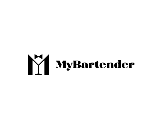
Version 3 of a logo for a new app designed for bartenders to let new and old patrons know when and where they're working while allowing patrons to find their favorite bartenders. The client requested a classic 1950's style harkening back to the days of Bogart in a white jacket. But yet it should be general enough to not exclude any gender or race, since the bartenders are a wide demographic. It should speak to the profession as a classy and craft oriented lifestyle, and show a resurgence of the pride in being a great bartender. The patrons are generally hip, young, and part of a night life scene. They love to use mobile apps to track the things they care about, and to connect with others. The client also mentioned the colors ivory and dark emerald green.
This concept combines M, Y, a martini glass, and a tuxedo.
As seen on:
Behance
Status:
Unused proposal
Viewed:
7055
Tags:
rank
•
mobile
•
green
•
typo
Share:
Lets Discuss
that's my absolut favorite design .... yes ... it is !!!!!
ReplyWinner! Icon is very clever:)
ReplyThanks both of you! I wish the client agreed! :)
ReplyThanks so much Lefty!
Replythisone is really goood
ReplyThanks Palattecorner! I really appreciate it!
ReplyThis one is perfect, Luma. Very simple, yet extremely clever. So sad that your client couldn't envision its full potential.
ReplyAbout them going with a different designer, pleaseeeeee tell me that you didn't do any of this work on spec, and that you protected yourself with a solid contract beforehand. Did you at least secure a deposit (which you would naturally keep)? Also, did this client pay you a cancellation fee?
FWIW, the chosen design completely disregards what seems to be a fundamental requirement of the brief, which was to avoid pinpointing any one particular race or gender. Fail.
Oh well. At least you have a great solution that's ready to be submitted to I Heart Logos 3, LP 2 (whenever David's ready to launch into that process again), Logonest 3 (whenever they start accepting submissions), and the Brands of the World Awards. :D
Jon, Thank you so much for your thorough comment! This was a regular contract not spec work. That's not the way I roll! :) It was all good for both of us, and I was fairly hired to create these concepts. It is a little disappointing that they went with another designer, but I wish them the best with everything. Thanks again for all your input, I am always excited to see your comments on my work!
Replyyah that's unfortunate the client didn't pick this. Works really well.
ReplyThanks nydesign! I was really excited about this solution too. Glad to see it in logomilk! Thanks!
ReplyNice and classy.
ReplyThanks so much Lecart! I'm really pleased with this solution, and I think it does fit the brief. Well, I guess you never know.
ReplyYou should be proud of this logo. Strong concept.
ReplyThanks pjmaster! It really means a lot coming from the hot-shot featured designer :)
ReplyI am really proud of this one. In fact, I have been secretly hoping to discover it on the front page...
Way to go Luma!
ReplyThanks so much cnasshan!
ReplyPlease login/signup to make a comment, registration is easy