MetalBrands
by ArtMachine • Uploaded: Sep. 27 '07 - Gallerized: Apr. '08
Description:
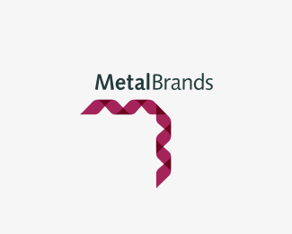
Alternative concept for Metal Brands, a metal producing and commercializing company.
Status:
Nothing set
Viewed:
11090
Share:

Lets Discuss
Nice one, Julian. The 'M' and 'B' is a clever touch.
ReplyThis is very nice. I like this better than the other one. Makes me think of metal shavings. (I'm guessing that's what you were going for?)
ReplyWell observed, Kev. *And Ryan, that goes for you too. :)
ReplyJulian, great idea here. I'm just not quite feeling the green. I also thought that the shavings could have more of a %22rolled%22 or rounded effect like real metal shavings. and not so abrupt 90 degree angle on the actual mark. Just my point of view, but great thinking.
ReplyVery kool Jules! Agree with Mikey though, love to see it in another colour.
ReplyArt... love this version my friend. However I'm thinking dark and industrial blues and grays.
Replyi agree with logomotive. it would add a bit more character to your piece! great going!
ReplyNice one.%0D*Metal is manly and strong.%0D*The color doesn't represent that.%0D*Rest all are great.
ReplyUpdate **
ReplyYeah Buddy!
Reply: )
ReplyDiggin' the color change.
ReplyThis is my logo for LogoLounge 6.
ReplyThanks Anthony!
ReplyCongrats Julian. Get in there!
Replythis is that same Julian? :D**Congratulations!
ReplyHope not, Raja :)*Thanks!
ReplyGood job...
ReplyAlways liked this! Maybe hard to fit in some spaces, but who cares? :)
ReplyThanks %3B)
ReplyPlease login/signup to make a comment, registration is easy