French Wine
by kairevicius • Uploaded: Nov. 06 '11 - Gallerized: Nov. '11
Description:
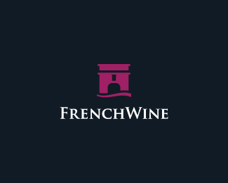
FrenchWine Logo
Mark consists of Trumph arc with bottle of wine in the negative space + river.
As seen on:
World Wine Collection
Status:
Just for fun
Viewed:
21892
Share:





Lets Discuss
looks great Paul !
Replygetting better, the best version
ReplySmart find, man!
Reply@Bernd,@Stelian, thank you my friends! :)*@Kamil, thanks glad to hear that everytime it looks better and better, but now I think it's final version :)**Also big thanks to all swimmers!
ReplyTop noch !
ReplyHaha! Nice to hear these words from you, buddy!
Replyamazing work here! float!
Replysmoke a joint! congratulations. glad to see how dreams are cuming true! :)
Reply@Rick and Deividas, thank you !*By the way, deiv, will smoke joint with you and soon :D
Replyfantastic work, nothing to criticize imo
Replynice mate, really like this one!
ReplyGreat !!
ReplyAnd a much better type choice. Great job Paul.
ReplyReally clever. Nice work.
Replycolors, mark, type, all great
ReplyThank you for possitive comments guys! It makes me motivated to do something more :) I am in the very good mood right now, thanks! :)
ReplyYou with Bernd can wine collection to be:)
ReplyDon't forget contrast8, lol*http://drbl.in/clCg
Replyman ... would be nice to see something from Brazil ...
Replyno, no, no....we can....we - must...:)
ReplyMuhammad Ali Effendy is going to make Pakistani wine :D
ReplyTexas wine: http://drbl.in/clEb*English wine: http://drbl.in/clDm**Funny game!
ReplyExcellent, readable idea of the logo!
Replywow!
ReplyThis is Awesome Paul, *execution, typeface, colors,*concept, COngrats for the *Gallery.**Obviously added to favs and*floated!
ReplyThank you all guys! You should see what's happend after this one:*http://www.behance.net/gallery/Conceptual-Wine-Tributes/2458423
ReplyOh boy.. great wine collection. Well played Paulius.
Reply%5Eagreed. this is cool!
Replylike it!
ReplyExcellent work, I really like it. Nice work action!
Replyhistoric logo... %3BD
ReplyVery very clever! Top of the class!
ReplyGreat idea and overall design!**I see a lot of wine logos lately, I guess wine inspires :)
ReplyBrilliant idea! Trendsetter.
ReplySuper ideia
ReplyAbsolutely awesome for me! I saw all your logos here and I'm just saying that this is very very very very amazing work!
ReplyGreat work!!!!!!
ReplyFellas! Thank you so much for your comments, it's always really nice to receive them :) Appreciate it!
ReplyReally outstanding. You're probably one of the most talented designer on the pond. Love your works!
ReplyOh wow, Luca! I really appreciate your words !!
ReplyClever! Also really like the colors.
ReplyBrillant work!
ReplyHi Paulius, can you please tell me if this logo is in use?? I saw something similar in Bratislava a few months ago.
ReplyI found their facebook page
https://www.facebook.com/FrenchWineBratislava
Please login/signup to make a comment, registration is easy