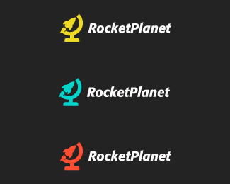
Rocket Planet Logo Design / Identity
by kairevicius • Uploaded: Mar. 12 '13 - Gallerized: Mar. '13

Float
(Floaters:
69 )
Description:
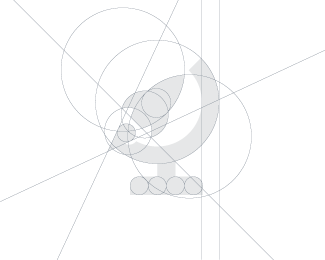
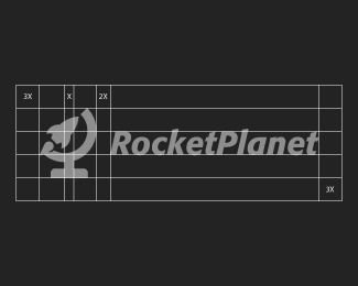
Rocket + Globe
Status:
Client work
Viewed:
24007
Tags:
corporate
•
globe
•
planet
•
rocket
Share:


Lets Discuss
I really like this Paulius! The type looks a little high in relation to the mark... Maybe move it down everrrr so slightly? :)
Replysolid work, Paulius!
ReplyVery Wow!
ReplySaw this on Facebook and was Very impressed.
Replyperfect!
ReplyYes, I agree! Perfect design!
ReplyThank you guys for your positive comments and floats!
ReplyDan, I attached additional image for you just to show how spacing was done :)
Thank you very much for showing the making Process as well. Very informative for me. I really loved the way those Circles are used.
ReplyGreat Design.
This is great! But personally, I still like the earlier version.
Replyforgot to mention on here too. really like this one.
Replylovely!
ReplySmart and clean design!
ReplyPlease login/signup to make a comment, registration is easy