Bertrams
by Simon™ • Uploaded: Mar. 17 '11 - Gallerized: Apr. '11

Float
(Floaters:
40 )
Description:
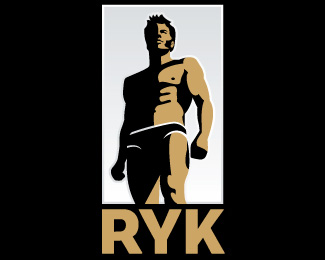
Premium brandy. Stylized cameo of the founder.
Status:
Unused proposal
Viewed:
6717
Share:


Lets Discuss
Thanks, Simon. Better than circle isn't present anything. Well, there can be a square :)
ReplyReally nice, strong.
Reply13mu:you got me. I've progressed to octagons. Maybe one day I'll be brave and try a tetrahexodon. %3B-)
ReplyThanks lecart! Appreciate it! :-)
ReplyThe black framework is too active. IMHO
ReplyGood stuff. Great work yourself, Simon!
ReplyI can't believe it! Do you expect me to now go and change a black border just because you think its too busy!!!?? Just kidding ... you were being so polite with your IMHO and all, I just had to take the piss! :-) I think you're right ... I'll fiddle and put a new one up.
Reply%3B-)
ReplyOK, Mr Babenko. The framework is thinner. Are you happy now? %3B-)
ReplyEver seen the movie 'Lost in Translation'? %3B-)
Reply... Very long:)
ReplyThat is - very much for a long time.*Yes, all so:)
ReplyLooks good.
ReplySheesh. I'm going right now to float and favourite all your logos. With passion like that, it must translate into good work. :-D
ReplyHAHAH! Fantastic work, and great job attracting strange comments!
ReplyThanks man! LOL. :-)
ReplySimon, you excuse that I have advised to you, education at me another - wanted to help:)**But to joke about it it is not necessary, I simply wanted to help:)**And difficulties of transfer.... Yes, it agree, certainly:)
ReplySorry dude, no more jokes. And thanks for the floats! :-)
ReplyGreat style!
Replywhat the hell is happening? logopond just got far more interesting! oh, and I like the simplicity of the logo!
Replywell done simon... congrats on another showcase
Replygreat Simon...i like the style
Replyamazing work !
Reply%5E%5E%5E%5E Danny, I assume you read the whole comments column! If I ever write a book, this will be good material for Chapter One. Thanks for the float!
Reply%5E%5E%5E%5E - %5E%5E Man-Grom, Anie %26 Mr Mirbach - you are all too kind. Thank you! :-D
ReplySimon, don't worry, it is made perfectly:)
ReplyHey Sergey! I missed you, man! Welcome back. Thanks for the compliment! Means a lot coming from a guy with so many gallery entries! :-)
ReplyHa ha at comments! Glad to Not be a part for a change :)
Reply%5E Ha. Ha. Good one Mike. Would be cool if we could only comment using pictures? I think that a lot of people here are better equipped visually anyway. %3B-)
ReplyClimaxDesigns %26 all* sorry for my english :)
ReplyROFL.
Replymilou,vot che ty rzhesh'? izuchi russkiy
ReplyGreat portrait logo.
ReplyIt's got a great feel to it. I'd so pick Bertram for my team in a fight.
ReplyPlease login/signup to make a comment, registration is easy