Anchorage Marina 01d
by atomicvibe • Uploaded: Nov. 18 '10

Float
(Floaters:
8 )
Description:
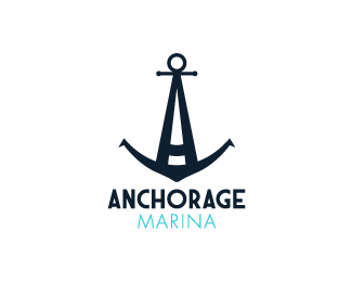
Hypothetical logo redesign for Anchorage Marina, a marina in my hometown of Baltimore, MD. I pass by there every day, and for months, I've been thinking about how much the marina could use a rebrand. So, I started sketching some ideas on paper, and in an uncanny bout of coincidence, Michael Spitz - from a world away in Croatia - posted a personal logo/typeface design with the same exact name earlier this week. Just goes to show how easy it is for two designers to develop similar ideas, completely independent of one another. Anyway, our respective marks are for different purposes; I may actually pitch these to Anchorage Marina. Type for 'Anchorage' is custom and is based on Art Deco maritime ad posters.
Status:
Work in progress
Viewed:
7086
Share:


Lets Discuss
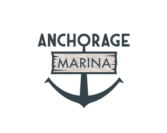
Here are other concepts: %3Ca href%3D%22http://logopond.com/gallery/detail/121412%22%3EOption 01a%3C/a%3E %3Ca href%3D%22http://logopond.com/gallery/detail/121413%22%3EOption 01b%3C/a%3E %3Ca href%3D%22http://logopond.com/gallery/detail/121414%22%3EOption 01c%3C/a%3E
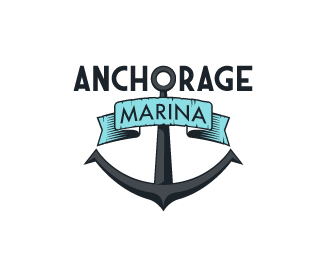
ReplyMade a few revisions to this. Changed color scheme, revised the A, added more hatch marks on the points. Any comments?
ReplyI like your mark, especially the retro shadow treatment...
ReplyThanks, Jordan! While I have used 3 colors in this design, I really wanted this concept to be able to survive in 1-color, because I think it would look great as an embossed stamp, or a wood carving.
Replyi like it..
Replybut i think the star is 2 big :)
ReplyPlease login/signup to make a comment, registration is easy