Description:
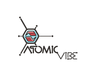
Redesign of my logo. I define ATOMICvibe as the "a-HA!" moment of clarity in the creative process. Like nuclear fusion, it's when tiny ideas coalesce, and then explode into beautiful design. The logo visually depicts this creative reaction. Forming abstract A & V shapes, the converging hands cradle the tiny beginnings of a big idea, fusing them until they discharge a shockwave of creativity. The custom type, designed to perfectly integrate with the mark, is meant to symbolize electron paths. Heavily inspired by retro imagery from the Atomic Age: science, the Space Race, Sputnik, the iconic George Nelson Ball Clock.
As seen on:
atomicvibe
Status:
Client work
Viewed:
4510
Share:

Lets Discuss
I figured the mark could use a little definition (highlights on the hexagon and hands), and slightly thicker-stroked lines. Any thoughts?
ReplyI personally would strip this all down, its too complicated. Focus on the hands and getting the type right.
ReplyI think your mark is cool but the type is what is making it seem complicated IMO....
ReplyThanks for the comments, guys. Regarding the type being too complicated, is it the dots you're having a problem with? Overall readability?
ReplyNot really, it's the overall choice of letter-forms, they feel awkward, I would look at an alternative, something cleaner and simpler.
ReplyHey guys, check out my new business card which uses this logo: http://bit.ly/iqsWSt
ReplyThe cards are great! nice job.
ReplyThanks, Rudy! Loving your showcase, btw.
ReplyJust saw your cards on Creattica and I have to agree with Rudy, they are wicked awesome!
ReplyThanks, Jordan. I appreciate the kind words :)
ReplyHere's the link to the Creattica showcase, which details my design rationale: http://bit.ly/jSggMr. The card is also featured on Card Observer: http://bit.ly/kN9Uwl and Cardview: http://bit.ly/m2CUGN
Replycool sign - great type - love it !!!
ReplyThanks for the feedback, Bernd!
ReplyYou've done a really good job! I've been dweling for some time now trying to figure out my own visual identity... discarded many things and finally working on some cube shape tings. Not an easy task for me mate, but you've succeded!
ReplyThanks, Martin! Branding oneself is one of the most challenging tasks a designer can face, and this one took forever to get to this point. If you have some time, check my ATOMICvibe identity development Flickr set to get a glimpse into my thought process: http://bit.ly/r5wzyE The set reads like a blog, so if you start at the beginning and work your way through each page, you'll see my design process unfold. This may not be the identity I live with forever, but it's going to stick around for a while, considering I recently had 1000 fairly expensive biz cards letterpress printed!
ReplyYou had lots of evolution there! You even had a Captain Atomic! :D It's a though path, but it must be walked sometime.**And those new biz cards are sick, not cheap indeed, but worth it!
ReplyThanks for checking that stuff out, Martin! Yeah, I love that little Captain Atomic character I sketched out. Maybe one day I'll develop it into something.
Replyquite like the mark, but you need to rethink about typography:)
ReplyYeah, others have said that. I respect all of your opinions, but unfortunately, this is a done deal for now, since it's on printed biz cards.
Replylike the concept and mark.. you maybe need to try with a different typeface :)*
Replyyou feel that earthquake buddy?
Reply%5EFunny thing was that I was at work in Silver Spring, and I *heard* it, but didn't feel anything. At first, it sounded like a very sudden, LOUD hailstorm, but when I looked out my window, all I saw was bright sun. A few seconds later, people were flipping out in the hallways, talkin' 'bout %22ZOMG ERFQUAKE WE'RE GUNNA DIE!!!%22
ReplyJon, are you on dribbble?
ReplyNope, I've been so busy with 800trillion other things, I haven't had a chance to make it over to Dribbble yet. Or Forrst. Or to update my HORRIBLY out-of-date, piece-o-crap Behance page. These are things I definitely want to tackle, though... at some point.
ReplyMy AV biz cards won the international award of 'Design of the Day' for 9/17/11 over at Design and Design, and will be featured in their year-end compendium, 'DesignandDesign.com Book of the Year Volume Four.'**http://bit.ly/avcards-design-and-design
ReplyCongratulations, Jon. Those cards are mega-awesome.
Reply%5E They are :) I have a spare Forrst invite if you're interested Jon.
ReplyThat would be great, Josh. Thanks! And thank you guys for the compliments.**If you're unfamiliar with Design and Design, you should check it out. Much like Creattica, they're super-selective about what they choose to feature on their site, but everything they select to feature is also judged by their jury for a) the Design of the Day awards, and b) publishing in their end-of-year books. The best part about this is that, unlike so many other design competitions and book publishing calls-for-entry, there are no registration or submission fees.**Admittedly, my current Design and Design gallery is the first batch of work they've selected to feature on their site, and I've been submitting stuff for a couple of years now.*http://bit.ly/av-design-and-design-showcase
ReplyMate, those cards rock! Printing fluoro, now thats brave...and pulls it off. Well done!
ReplyThanks, Norman! Do you know how long I've waited to print something in fluorescents? A LONG TIME, that's how long. From very early on, I knew I wanted to use fluorescents in the ATOMICvibe branding, and Pantone 805 definitely makes a statement. It also really coincides with the %22atomic,%22 and %22nuclear%22 themes.
ReplyInvite sent :)
ReplyWhy I never floated this one is so good! FIXED!
ReplyHey thanks, Radek! I appreciate the comment :)
ReplyPlease login/signup to make a comment, registration is easy