Baird
by richardbaird • Uploaded: Apr. 08 '10
Description:
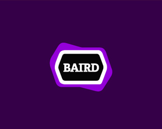
Self directed branding for my freelance business.
As seen on:
www.richardbaird.co.uk
Status:
Client work
Viewed:
3676
Share:

Lets Discuss
I think that 'Baird' in the black enclosure would suffice, the purple one seems a bit odd to me and makes it too busy...
ReplyInteresting thought, I believe the shape has something quite pleasing about it, slightly out of the norm. Thanks for taking the time to look and comment, you certainly have a seriously big, diverse and impressive portfolio!
ReplyMe too, it's unique with that shape.
ReplyI dig it. The shape pulls me in for some reason. Also feels timeless. Great potential for brand suite application.
ReplyThanks for your comments, it's great to get them from the top contributors on this site!
ReplyYeah, it has a nice feel to it! Good job!
Replygood solid job!
ReplyIt works great in small sizes, nice solution.
ReplyI like the purple shape. I don't think this logo would be half as cool without it. It's unique and engaging.
ReplyThanks, I went through a lot of iterations to get to this shape!
Replyvery clean memorable mark. Nice job!
ReplyPlease login/signup to make a comment, registration is easy